Effective Triangle Composition for Displaying Anime Figurines
Using triangle composition turns a simple lineup of figures into a display with depth, balance, and a clear focal point by relying on height and placement to guide the eye.
Ever line up a full wave of figures on a shelf, step back, and feel strangely underwhelmed? Collectors who stop arranging everyone in a straight row and start playing with triangle-shaped groups usually find their displays easier to read, photograph, and enjoy every day. By the end, you will know how to build those triangles on any shelf, match them to your characters’ vibe, and keep everything looking clean instead of cluttered.
Why Triangles Make Figure Displays Instantly Better
In art, the way you arrange elements on a canvas is called composition, and it is what makes a piece feel balanced, readable, and emotionally strong. When you place a character in a display case, you are doing the same thing: deciding what the viewer sees first, where their gaze travels next, and whether the whole scene feels calm, chaotic, or epic.
Across photography, triangles are one of the simplest shapes that reliably guide the eye and make images feel intentional rather than random. Educators who study how triangles improve composition point out that any three key points can form a triangle that keeps the viewer’s gaze looping around the frame instead of bouncing off in a second. Upright triangles with a wide base feel solid and grounded, while tilted or upside-down triangles feel more tense and energetic.
Interior stylists use the same idea when they group decor on shelves. Guides describe arranging three items so you can visually connect them into a triangle, often by using one tall anchor, a medium piece, and a smaller object in front to add depth, so the eye moves smoothly between them instead of skimming past a flat row of objects. Shelf styling advice also talks about the “triangle method” as a simple way to make bookcases look curated instead of cluttered, which maps almost perfectly to figure shelves that face the same chaos-versus-cohesion problem.
For figure collectors, that means each triangle on a shelf can act like a tiny scene: one main character, two supports, clear height differences, and a shared visual thread such as color or theme. Instead of a “warehouse of merch,” your case starts to read like a storyboard where each group tells its own mini story.
Building Your First Shelf Triangle
Choose a clear main character
Photography tutorials on subject hierarchy stress picking one main subject and letting everything else support it, rather than letting multiple equally loud elements fight for attention. On a shelf, that is your hero: the grail or the character you want people to notice first.
Practically, choose one figure to be slightly larger, closer, or better lit than the others. Composition guides suggest that the main subject should occupy more visual weight and sit in a strong position rather than blending into the crowd, just as painters and photographers place focal points near strong lines or intersections instead of dead center in composition strategies.
Add two supporting pieces to complete the triangle
Design principles talk about the “rule of odds”: odd-numbered groupings, especially sets of three, look more interesting and natural than even-numbered ones because three points automatically create a triangle that feels complete without being stiff. Home-styling guides echo this by recommending groupings of three decor pieces, which tend to feel more relaxed and visually pleasing than pairs lined up like bookends.
For a basic shelf triangle, pick two supporting figures that share something with the main one: same series, similar color palette, or a shared mood. If your apex is a tall, detailed scale of a protagonist, you might flank it with a smaller rival on one side and a chibi or Nendoroid on the other. The key is spacing them so you can mentally connect their heads or key features into a triangle instead of a straight line.
Use height and depth to shape the triangle
Stylists describe a good triangular grouping as having one tall object, one medium-height piece, and a smaller item placed slightly in front, forming a multidimensional triangle that feels dynamic but balanced. Layering advice also suggests anchoring with the tallest item at the back, then staggering a second piece to one side and a third piece lower and closer to the viewer to introduce depth.
Applied to figures, use risers or even stacked artbooks so the tallest character sits slightly higher and farther back. One support can be mid-height on a shorter riser or directly on the shelf, and the smallest can sit closer to the glass. When you connect their focal points, you should see a clear triangle both in height and in front-to-back depth.
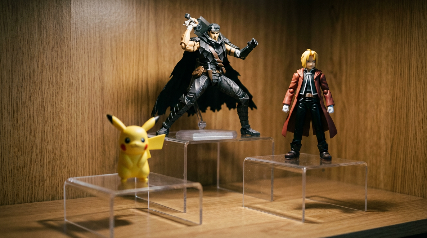
Photography tutorials on the golden triangle show how aligning elements along a strong diagonal produces a more dynamic flow, and you can mimic that by letting your figure triangle lean from back left to front right or the other way around in golden triangle composition.
On a practical shelf, you might start with a tall battle-pose figure centered toward the back, add a slightly shorter ally to the right, and pull a tiny mascot figure forward on the left. Before, the trio might have read as a stiff lineup; after, the eye naturally climbs up one character, hops across to the apex, and then drops into the mascot, completing a satisfying loop.
Matching Triangle Types to Your Collection’s Mood
Photography educators note that different triangle orientations dramatically change mood: upright triangles feel stable and grounded, while rotated or inverted triangles introduce tension or a sense of motion. Camera brand tutorials add that an upright triangle with a broad base is especially effective when you want a calm, solid feeling, whereas angled or reverse triangles feel more graphic and dynamic.
Here is how that translates to figures:
Triangle orientation | Mood and use case | Easy figure tweak |
|---|
Upright, wide base | Stable, iconic, “team assembled” energy; great for hero groups and slice-of-life scenes | Tallest figure in the center back, two supports forming a wide base left and right |
Upright, off-center apex | Balanced but less formal; good for leader plus squad or upperclassman plus underclassmen | Apex shifted slightly left or right, with base figures filling the opposite side more heavily |
Diagonal or tilted | Motion, chase scenes, dramatic attacks, flying poses | Apex placed near one side and slightly forward, with supports stepping down along a diagonal |
Inverted or near-inverted | Tension, unease, villains, or chaotic energy | Two taller figures at the back corners, one smaller or crouched figure close to the front center |
When you want a calm “festival episode” shelf, build a wide upright triangle where the base figures are spread comfortably and the apex sits above them like a centerpiece. For a shonen fight shelf, push the apex toward one side, tilt bodies and effect parts along the same diagonal, and let the triangle lean so it feels like the action is charging across the glass.
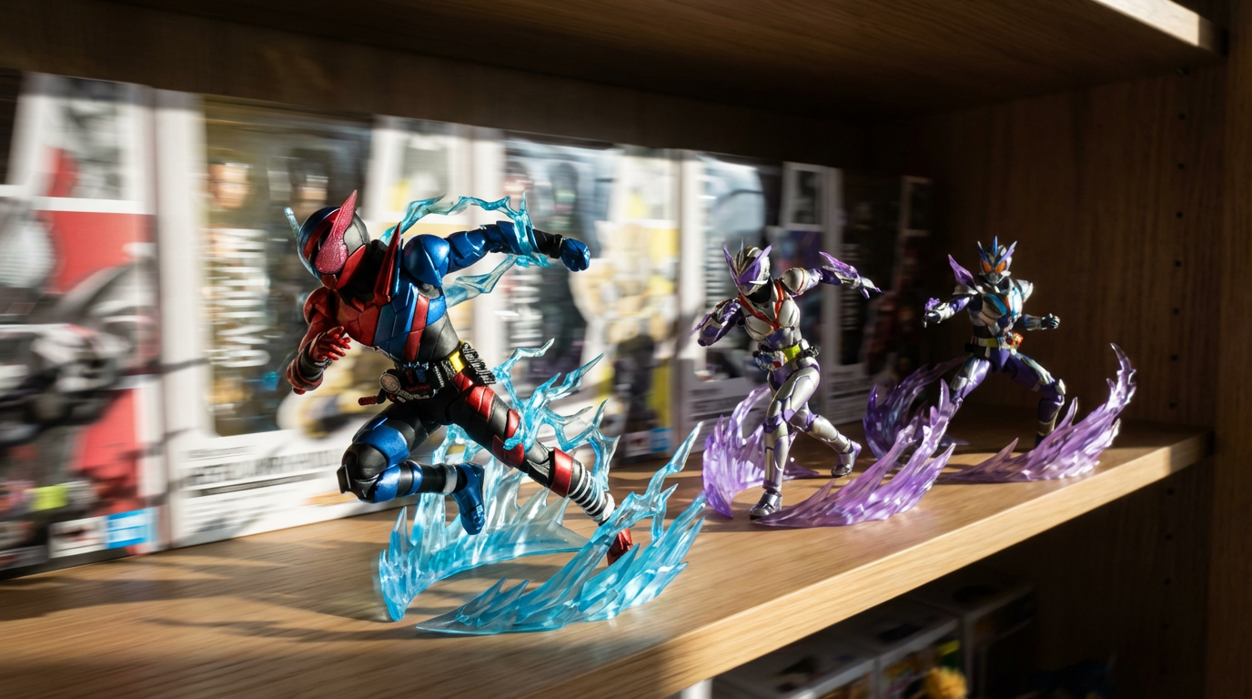
Landscape photographers often use diagonals and triangular divisions to make scenes feel more alive and to control how the viewer’s eye travels across the frame in golden triangle rules. Think of your cabinet the same way: an upright triangle on one shelf can balance a more tilted, energetic triangle on another, giving the whole cabinet rhythm instead of everything shouting in the same tone.
Designing Whole Cabinets with Visual Triangles
Art instructors sometimes talk about “visual triangles,” where three areas that share the same color, value, or detail form a larger triangle that keeps the viewer’s gaze bouncing around the piece. The idea is that your brain connects these similar spots into a pattern, and your eyes linger on whatever lies inside or along that triangle, which is a powerful way to maintain flow across a complex image.
Interior stylists use almost the same trick at room scale, placing related accents so they form invisible triangles that make spaces feel calm and cohesive rather than randomly decorated in visual-triangle decorating tips. Bookshelf advice describes using a clear triangle method to keep shelves looking intentional, even when they mix books, objects, and empty space.
On a figure wall, think in layers.
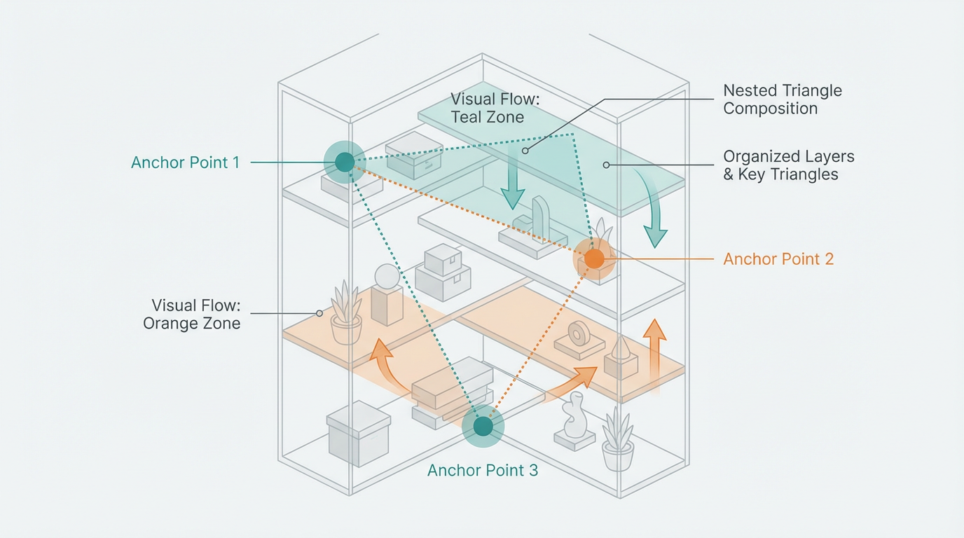
Each shelf gets its own small triangle built from characters and risers. Then, across the whole cabinet, pick three “visual anchor” points that form a larger triangle: maybe the only three figures with vivid red bases, or the three tallest statues. Place one near the top left, one closer to the center right, and one toward the lower left so that, when someone scans your collection, their eyes zigzag down in a big triangle instead of dropping straight to the middle and stopping.
Photographic essays on triangles show how repeating triangular forms at different scales, from small details to whole structures, can turn ordinary scenes into cohesive stories. You can do a similar thing with figures by echoing triangular groupings from one shelf to the next: maybe every row has one prominent apex character and two flanking supports, but their height, color, or pose shifts to fit each theme.
At the same time, both artists and stylists warn that too many competing focal points or cluttered shapes make it hard to see any single triangle clearly. Composition guides recommend simplification—removing distractions and letting a few strong shapes carry the design—so the main subject is not drowned in noise. When arranging figures, that often means accepting that not every acrylic stand, badge, or trading figure can live on the front row; some pieces may need a “rotating cast” box so the triangles on display stay readable.
Color, Bases, and Effects: Invisible Triangles That Hold the Scene
Composition articles emphasize that color and value (light and dark) are powerful tools for directing attention and creating unity in an image. Visual-triangle tutorials suggest picking three areas that share a strong quality—such as bright red, deep shadow, or a repeating texture—and letting them form a triangle that keeps the eye moving within your frame rather than drifting out to the edges.
With figures, you can build these invisible triangles even when poses and heights are already set. If you have several characters with teal hair or aqua effects, spread three of them so their heads or effect parts sketch a triangle across the shelf. If you run accented LED strips, consider three main “hot spots” instead of a uniform wash so the brightest areas form a triangle around your apex figure and keep attention anchored there.
Home-styling advice also notes that mixing textures and materials inside a triangle—like smooth ceramics, soft greenery, and rougher surfaces—makes the vignette more interesting without turning it chaotic. For a figure display, that might mean combining glossy plastic bases, a matte artbook behind them, and a small plant or prop to soften the scene, as long as those elements still support the main triangle instead of blocking faces or key details.
Food stylists using triangular platters talk about how combining color, shape, and texture on a triangular surface elevates the overall presentation and makes guests “eat with their eyes” before they taste anything. The same idea applies to a triangular figure grouping: if the colors harmonize, the textures vary just enough, and the shapes all contribute to the triangle rather than fighting it, the shelf feels more like an illustration panel than storage.
Pitfalls That Break Triangle Magic (And Easy Fixes)
One common problem is the “police lineup” shelf, where every figure stands at the same height right along the front edge. Photography and decor resources both point out that straight, evenly spaced rows feel stiff and less engaging than staggered arrangements with height and depth differences. The fix is to pull a few figures back, lift some up, and consciously build at least one triangle instead of a flat line.
Another issue is when two or three big figures compete as main characters. Camera-brand tutorials show that when the primary and secondary subjects are similar in size or brightness, viewers cannot tell what they are supposed to look at first, and the image feels muddled. On a shelf, if you have several grails, give each its own triangle and avoid stacking them shoulder to shoulder in the same row; let one be the apex in one grouping while the others step down slightly in height, distance, or lighting.
A third trap is overstuffing triangles with too many extra items. Composition guides warn that past a certain point, additional shapes and accents stop adding interest and start adding confusion, because the viewer’s eye no longer knows where to rest. If your triangle feels noisy, try removing one figure or prop at a time and stepping back; usually, one or two cuts will suddenly make the whole structure clear again.
FAQ: Triangle Composition for Figurine Displays
Can triangle composition work if I only have two figures?
Yes, as long as you are willing to let a prop or background piece act as the third point. Interior-styling references treat stacks of books or a single vase as part of a decorative triangle with two other objects. For figures, a framed print, a themed box, or even a small plant can become the third corner that completes the triangle and makes the pair feel intentional rather than lonely.
Do I always need risers to build triangles?
Risers help, but they are not mandatory. Photography tutorials on triangle composition remind you that triangles can be implied by spacing and perspective even when physical heights are similar in triangle-composition intros. You can fake height differences by placing one figure farther back, letting the shelf’s depth and viewing angle create the sense of a peak, especially if you support the shape with lighting and color triangles.
How do I use triangles if my collection is mostly tiny figures or keychains?
In that case, think in clusters rather than single characters. Guides on visual triangles describe building triangles out of repeating colors, brightness levels, or even similar types of negative space rather than just object size, which works well for many small items arranged together. Group your tiny pieces into small flocks of three where their shared color or theme forms a triangle, then treat each flock as a single “dot” in a larger cabinet-scale triangle.
A well-built triangle gives every character a role: the apex leads, the base supports, and the whole group feels like a moment frozen from your favorite anime instead of a random pile of plastic. Next time you reset a shelf, think less about filling every inch and more about sketching triangles in your head—once you see them, it becomes hard to go back to straight rows.