Mastering Visual Balance Techniques for Figurine Display
Turn your figurine shelves into gallery-level displays with visual balance techniques that make every character readable, dramatic, and easy to appreciate.
You line up a new grail on the shelf, step back, and something just feels off: one side looks heavy, colors are fighting, and your favorite character disappears into the crowd. After countless late-night rearranging sessions and photo shoots, the difference between a “meh” shelf and one that stops people in their tracks almost always comes down to how well the visual weight is balanced. This guide walks through practical, repeatable ways to balance your figurine displays so your collection feels curated, not cluttered.
Why Visual Balance Matters For Figurine Shelves
On a shelf, every figure, stand, and backdrop carries “visual weight” based on size, color, contrast, and detail. When that weight is evenly distributed, the whole arrangement feels calm and intentional; when it is not, even expensive scale figures can look cheap or lost. Design and merchandising teams rely on balanced product displays to shape first impressions and guide attention because most decisions happen right in front of the display, not in advance. That is why stores treat layout as a core sales lever rather than decoration alone. Retail visual merchandising uses the same principles you can borrow for your shelves at home.
Graphic design treats balance and white space as the difference between amateur and professional work, because they determine where the eye lands first, what gets ignored, and whether a layout feels overwhelming. When you give each element enough breathing room, viewers naturally follow a path through the composition instead of bouncing around or tuning it out. Using the same balance and white space ideas on a Detolf or bookcase shelf helps your eye glide across your collection, noticing expressions, bases, and tiny accessories that are usually lost in visual noise. Balance and white space are not just abstract art-school terms; they are extremely practical tools for collectors.
There is also an emotional side. Symmetrical, grounded arrangements feel orderly and almost “museum grade,” which suits serious, elegant characters or premium scale figures. More asymmetrical, dynamic groupings feel energetic and playful, which works beautifully for shonen-style anime power-ups, mecha, or action poses. In retail, both approaches are used intentionally to send different signals for luxury versus edgy modern brands, and the same thinking translates directly to how your collection reads at a glance. Symmetrical and asymmetrical balance are just different ways to reach harmony, not “right versus wrong.”
Core Balance Styles You Can Use On Your Shelves
Symmetrical balance: the “museum” look
Symmetrical balance happens when the left and right sides of a display mirror each other in visual weight. That does not mean identical figures, but similar height, color intensity, and spacing around an invisible center line. Design work that leans on symmetry tends to feel stable, calm, and trustworthy, which is why you see it in many luxury and institutional layouts. That same mood fits regal or formal characters very well.
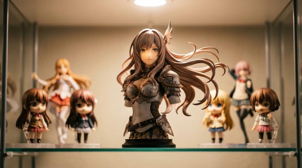
For figurines, this might look like a tall 1/7 scale figure in the middle, flanked by two medium scale figures of similar height, then shorter Nendoroids or acrylic stands on the ends. Colors on each side loosely echo one another so no corner pulls all the attention. The upside is that it is easy to read and very forgiving for beginners; the downside is that it can look static or a bit rigid if every shelf in a room is arranged this way.
Asymmetrical balance: dynamic dioramas
Asymmetrical balance uses different elements on each side of the display but still feels stable overall. Designers do this by counterbalancing one large or dark element with multiple smaller or lighter ones, using scale, color, and white space to keep the “see-saw” from tipping visually. Well-executed asymmetry feels human and modern, and it naturally draws your eye to a focal point, which is why many contemporary brands lean on it for expressive layouts. Asymmetrical balance is powerful but demands more judgment.
On a shelf, that might mean a single dramatic centerpiece figure on one side balanced by a cluster of three smaller characters on the other, arranged at stepped heights. A small but intensely colored Nendoroid can visually offset a larger, muted statue if you give it space and perhaps a contrasting base. The benefit is energy and storytelling: you can stage a battle, graduation, or festival scene that feels alive. The risk is overloading one side with too many heavy colors or sizes, which makes the scene lopsided instead of dynamic.
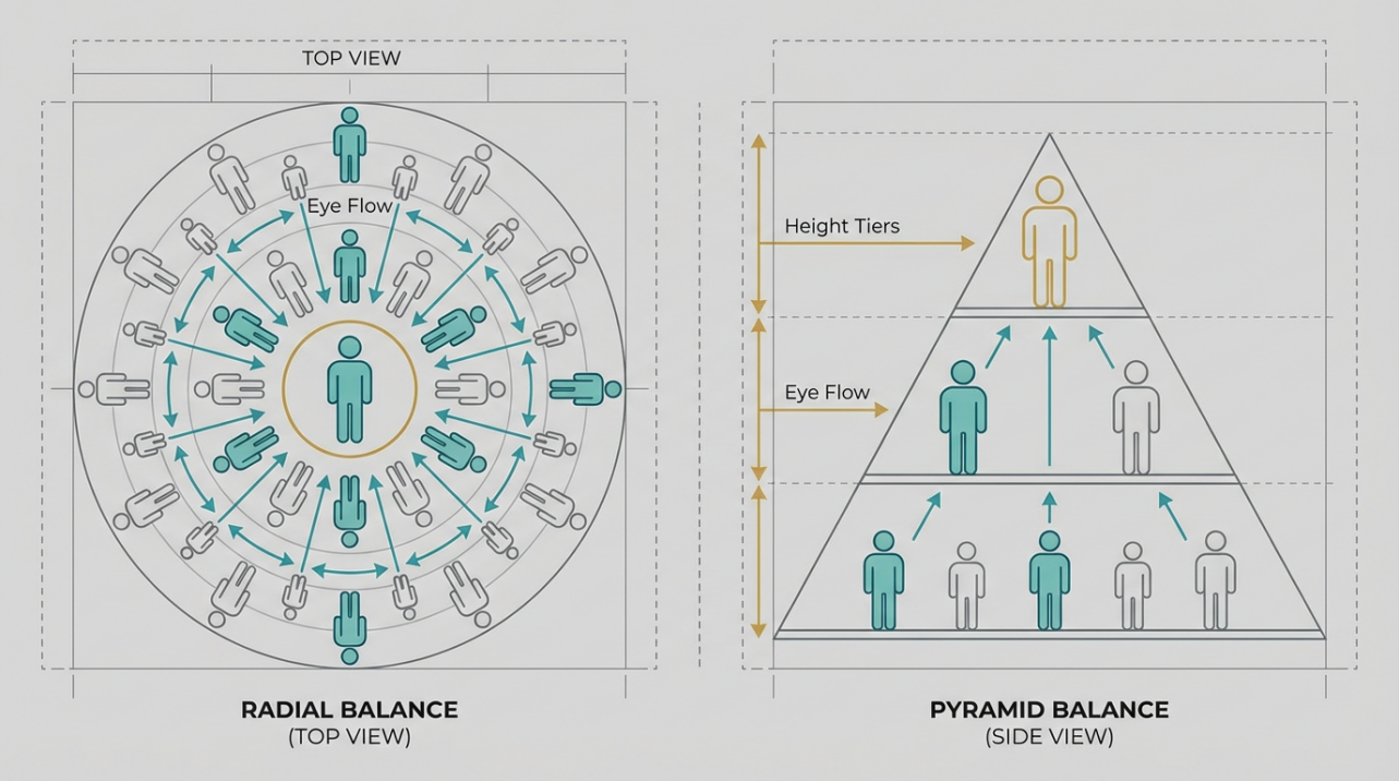
Radial and pyramid balance for shrines
Radial balance arranges elements around a center point, pulling attention inward first and then out. In display design, you see it in circular layouts and focal windows that radiate from a hero object. Pyramid compositions are similar but use a triangle instead of a circle: a strong focal point at the top or center with supporting pieces stepping down. Retail visual display guides treat pyramids as one of the most reliable shapes for drawing the eye to a hero item while keeping the group coherent. Basic principles for visual displays often start with these shapes before anything more complex.
For figurines, radial balance is perfect for a character shrine: a central grail in the middle, with key side characters, chibi versions, and acrylic charms subtly circling around, all angled toward the center. Pyramid balance works beautifully with a single tall figure on a riser, mid-height figures on either side, and smaller accessories or trading figures along the front edge. The advantage is that radial and pyramid shapes naturally signal importance; the trade-off is that they are so strong that you may not want to use them on every shelf, or the room can feel visually repetitive.
Step-By-Step: Balancing A Mixed Figurine Shelf
Step 1: Choose an anchor and focal point
Every balanced display needs an anchor: the piece that sets the tone and scale for everything else. Retail display checklists usually recommend placing the largest object first to anchor the arrangement, then building around it, because it becomes the natural focal point and keeps you from overfilling the space. Creating effective displays stresses that this first placement shapes the entire composition.
On a figurine shelf, pick the character you most want people to notice and place that figure roughly at eye level for someone standing or sitting in your room, depending on how you normally view the collection. If it is a tall 1/4 or 1/6 scale figure, aim near the center; if it is smaller, you may raise it on a riser. Once that anchor is down, every other decision becomes a question of how to support, not compete with, that focal point.
Step 2: Match visual weight, not physical size
A small, vividly colored Nendoroid can pull more attention than a larger, pale figure; thick black bases feel heavier than clear disks; a glossy metallic armor reads louder than a matte school uniform. Visual weight, not physical weight, is what affects balance. Guidance for gallery walls and display groupings emphasizes how saturated colors and high contrast frames can feel “heavier” than larger but subtler pieces, which is why heavy elements are often placed toward the center or bottom to anchor a composition rather than near one extreme edge. That same reasoning keeps figurine shelves from feeling like they might “tip” visually.
Try this sequence as you place figures: mentally draw a vertical line through the center of the shelf, then ask whether the left and right sides feel roughly equal in attention-grabbing elements. If one side has three dark, detailed bases and the other side has light, airy ones, add a darker stand or a more saturated figure to the lighter side, or shift a heavy piece back toward the middle. You do not need perfect symmetry; you just want to avoid one side screaming while the other whispers.
Step 3: Use levels and depth for movement
Balanced retail displays rarely keep everything at the same height; they use steps, fans, and lines to guide the eye up, across, and down again. Principles for visual display shapes highlight pyramids, steps, and fan layouts precisely because this rhythm of heights keeps shoppers looking without losing their place.
On your shelf, risers, manga stacks, and acrylic platforms are how you build that rhythm. Place your anchor figure slightly forward or backward depending on how deep the shelf is, then stagger supporting characters so heads form gentle diagonals or triangles instead of a flat line. Depth matters as much as height: figures closer to the front feel heavier, so a large figure set farther back can balance a smaller one near the glass. This layered approach stops taller pieces from blocking shorter ones, and it turns a static row into a mini scene.
Step 4: Edit with white space and lighting
Design articles repeatedly push a simple rule: less is more. Negative space, the areas of emptiness around elements, is not wasted; it helps the important parts stand out and keeps viewers from feeling overwhelmed. Visual merchandising guides frame empty regions as “breathing room” that allows focal products to shine and makes the entire display more readable for shoppers. Elements of visual merchandising treat space as a core design ingredient, not an afterthought.
On a figurine shelf, that means being brave enough to leave pockets of open shelf between clusters instead of cramming every inch. After you think a shelf is done, step back several feet, squint a little, and notice where your eye jumps. If there is no pause between figures, remove one or two and let that gap become part of the composition. Then adjust lighting: a small spotlight or LED strip angled toward your anchor figure reinforces the focal point the way accent lighting does in retail windows.
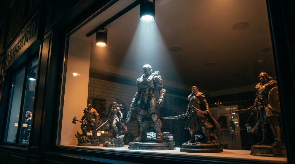
Window display techniques use bright, focused light on a hero product surrounded by softer support pieces; your shelf can mimic that strategy in miniature.
Fixing Common Balance Problems Collectors Face
When the shelf looks crowded and noisy
If your first reaction is “too much,” the problem is usually both quantity and lack of hierarchy. Visual merchandising playbooks stress simplicity and clear themes so customers can understand what they are looking at in a split second, recommending that retailers avoid overcrowding and stick to a focused story per display. Creating effective displays underlines that knowing when to stop adding is part of the craft.
To fix a noisy shelf, remove everything, then start again with a single theme such as “school festival,” “mecha hangar,” or “blue-haired mages.” Place your anchor character, add only figures that reinforce that theme, and relocate outliers to another shelf instead of forcing them in. Leave intentional gaps between clusters, and if you still have many small items like keychains or acrylic stands, group them tightly on a dedicated base so they read as one textural element rather than clutter.
When one side always feels heavier
A lopsided shelf is usually a sign that visual weight is not evenly distributed. Display advice for product groupings recommends treating your arrangement like a see-saw, adjusting by moving the heaviest visual elements closer to center or adding another strong piece on the lighter side until both halves feel roughly equivalent. Grouping guides also highlight the value of “rule of odds” clusters—groups of three or five objects—for a more natural-feeling balance and flow. Product grouping techniques show how these odd-numbered clusters help unify displays.
Bring that logic to your figures by turning some areas into deliberate trios: one tall, one medium, one small. If a massive, dark mecha dominates the right side, you can balance it by moving it slightly inward and arranging three bright characters on the left at varied heights. If that still feels wrong, the fix is often to remove one visually heavy item rather than to keep adding more.
When mixed sizes look chaotic
Combining prize figures, scales, Nendoroids, and acrylic stands on one shelf can easily devolve into chaos. Display design frameworks recommend starting with clear shapes, like pyramids or lines, and building proportions carefully so items are neither lost in empty space nor crammed together. Keeping a strong anchor and stepping down in size from that point helps sets feel intentional. Basic display principles treat proportion as key to avoiding awkward, underpowered arrangements.
For mixed shelves, choose which size class leads. If it is a scale shelf with a few chibis, let the scales define the main pyramid or line and tuck Nendoroids together at the front, almost like a chorus line. If it is a Nendoroid and prize shelf with one or two nicer scales, treat those scales as back-row scenery and keep the front row consistent in head size so it does not look like every character lives in a different world. Consistency inside each cluster plus clear shapes across the whole shelf makes the variety feel rich rather than random.
FAQ
How many figures should go on one shelf for good visual balance?
There is no perfect number, but most shelves look best when there is enough negative space to clearly see the base and silhouette of each main figure. Display research focuses less on item counts and more on clarity: shoppers engage more when displays are simple, focused, and easy to read, which lines up with the “less is more” guidance used in retail windows and focal points. Using that same mindset, aim for the minimum number of figures that still tells the story you want, then stop.
Should every shelf in a room use the same balance style?
Not necessarily. Stores often mix symmetrical focal displays with more dynamic, asymmetrical feature areas to keep customers visually engaged while still feeling oriented, balancing calm structure with exciting moments. Applying that idea to a collection, you might use symmetry for your most serious character shrines and asymmetry for action-heavy series, so the room has a rhythm as your eye moves from shelf to shelf.
Is it better to group by character, series, or color for balance?
Any of those can work as long as the grouping creates a clear theme. Visual merchandising theory treats grouping by story, season, or color as different but equally valid ways to help people quickly understand what they are looking at and why items belong together. Color-based arrangements can be especially powerful for balance, because repeating similar hues across a shelf naturally evens out visual weight, while character or series groupings lean more on pose, size, and props to keep things harmonious.
A well-balanced figurine display feels like a frozen moment from your favorite world, not just a storage solution. When you start thinking in anchors, visual weight, shapes, white space, and light, every new box you open becomes an excuse to refine that little gallery rather than a problem of where to cram one more base. Keep experimenting, keep taking step-back photos, and enjoy the quiet thrill when someone walks in, points at your shelves, and says, “This looks like a high-end store display.”