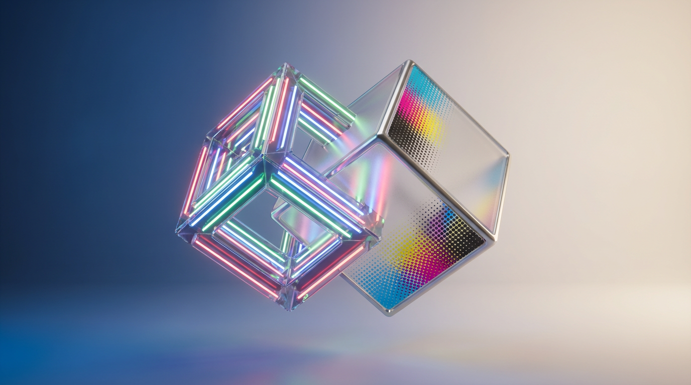
Understanding RGB and CMYK in Color Theory for Collectibles
If you have ever ordered a “limited run” wall print of your favorite anime character, only to unwrap it and realize her hair looks weirdly muddy compared to your screen, you have already met the real final boss of the hobby: color modes.
As a collector and fandom storyteller, I have lived that heartbreak. The glossy PVC figure on my shelf pops with neon pinks and electric teals; the photos look god-tier on my laptop; then the printed shikishi board or art book page comes back and everything looks like it lost two levels of saturation and at least one star of rarity.
The good news is that this is not random bad luck. It is almost always RGB versus CMYK doing their thing behind the scenes.
In this guide, I will walk through how RGB and CMYK actually work, why they fight over your waifu’s hair color, and what that means for figure photography, fanart prints, card-style collectibles, packaging, and custom merch. I will lean on what color experts like Pantone, Interaction Design Foundation, Art of Where, and print-focused studios have documented, and translate it into the language of collectors, artists, and fan-merch makers.
Color Theory For Collectors: Models, Not Magic
Color in our hobby is doing three jobs at once. It has to look good to the human eye, it has to survive the journey from artist to screen or printer, and it has to tell a story about the character or brand.
Designers on Artist Network describe color theory as the meeting point of the physics of light and the psychology of color. They emphasize that mastery comes less from memorizing formulas and more from training your eye and practicing. That tracks with collecting too. The more figures, prints, and boxes you see under different lighting, the more you feel when a red feels “off” or a skin tone looks “cold.”
Under the hood, though, there is some very concrete math happening.
Color models are just systems for describing colors using numbers. Pantone explains that a model such as RGB or CMYK defines the ingredients, while a color space such as sRGB or Adobe RGB maps those numbers to specific, real colors a device can show.
For our purposes, two models matter most:
RGB, which mixes light and is used by all your screens.
CMYK, which mixes ink and is used by almost everything that gets printed.
Understanding those two is the key to predicting whether that sunset-hued key visual of your favorite series will stay vibrant on a poster, or fall flat when it becomes packaging, art prints, or card backs.
RGB: The Light-Based World Of Screens
What RGB Actually Is
RGB stands for Red, Green, Blue. According to resources like Amadine and GraphicImage, it is an additive color model: you start with black (no light) and add red, green, and blue light in different intensities until you reach white.
Each pixel on a monitor or cell phone works this way. It stores three values, typically from 0 to 255, one for each channel. A pixel with values 0, 0, 0 is black. A pixel with 255, 255, 255 is white. Mix different values and you get everything from deep navy to bright cyan. Mathematically, this 0–255 range per channel yields 16,777,216 possible colors. As the Amadine explainer notes, that is more colors than the human eye can even distinguish in practice.
This is not arbitrary. Our eyes have three types of cone cells, most sensitive to long (red), medium (green), and short (blue) wavelengths of light. RGB is built to piggyback on that biology. When your monitor throws a specific combo of red, green, and blue light at you, your vision system does the rest and turns it into perceived color.
Why RGB Makes Your Figures Look So Vibrant Online
Screens are backlit. Interaction Design Foundation and other digital design guides point out that RGB is the natural language of light-emitting devices: monitors, televisions, tablets, game consoles. Because it works directly with light, RGB can display very bright, almost neon colors that feel impossible on paper.
Print-focused sources such as Clip Studio Paint’s color-space guide explain one of the big frustrations we all share: RGB can display eye-searing, luminous colors that general CMYK printing simply cannot reproduce. That is why the shock-pink streaks in a character’s hair or glowing magic effects seem to hum on your monitor but come out muted on a poster.
RGB also tends to be the default color mode for digital tools. Cameras, scanners, and apps like Photoshop generally create RGB files first. The Noun Project and GraphicImage both note that RGB is optimized for screens and has a larger color gamut than CMYK, yet RGB files are often smaller, which is nice when you are uploading photos of your collection to a marketplace.
When To Use RGB For Collectibles
Across multiple sources, there is near-unanimous advice: use RGB whenever the final experience is digital.
That means RGB is ideal for online shop product photos of your figures, digital-only trading cards and icons, social media banners and previews, video thumbnails and overlays, and digital illustrations meant to live on screens, such as VTuber assets or motion graphics.
Print-focused studios like Art of Where and fine art printing guides go even further. They recommend that artists actually work in RGB while designing, even when they plan to print later. The reason is that RGB gives you full access to digital effects and the same color model your monitor uses. Then, just before printing, you convert with the correct profile for the chosen print medium.
If you photograph your scale figure or garage kit, edit the image in RGB, and publish it online, you are playing to the strength of the mode.

Your audience will see something close to what you see on your screen, assuming their monitors are halfway calibrated.
On the plus side, RGB gives you more vivid colors and more flexibility. On the flip side, RGB is not reality for ink on cardboard, paper, acrylic, or fabric. That is where CMYK comes in.
CMYK: The Ink-Based World Of Boxes, Prints, And Merch
What CMYK Actually Is
CMYK stands for Cyan, Magenta, Yellow, and Key (Black). It is a subtractive color model, used by traditional four-color printing. Instead of shining light at your eyes, it puts pigment on a usually white surface and relies on reflected light.
Pantone and GraphicImage explain that each CMYK channel is typically expressed as a percentage from 0 to 100. The paper itself is the “white.” Zero ink means you see pure paper; heavy coverage of inks means the paper reflects less light and you see darker colors.
In theory, cyan, magenta, and yellow inks should be able to mix to create any reflective color. In practice, as Pantone’s color-models article details, real inks are imperfect. Equal amounts of CMY give a muddy brown instead of a deep black. That is why printing adds black as a separate “key” plate. It handles detail, text, and true dark neutrals more efficiently and cleanly.
CMYK also uses halftoning, as color-system explainers note: tiny dots of the four inks in various densities blend to the human eye into continuous colors such as pink skin tones or soft gradients. When you look closely at a card or box under magnification, those dots are visible.
Unlike RGB, CMYK has a much smaller gamut. The Noun Project’s comparison estimates CMYK at roughly 16,000 colors, far fewer than RGB’s 16.7 million. Bright, saturated RGB colors, especially neon-like greens and intense purples, often fall outside what CMYK can reproduce.
Why Printed Collectible Art Looks Duller Than Your Screen
Print studios like Art of Where, Clip Studio Paint’s guides, and Printful’s print-on-demand documentation all point to the same core issue: RGB images are lit from behind; print is just ink on a passive surface. The paper or cardboard does not emit light, so colors almost always look darker or more subdued than the same file on a monitor.
Art of Where gives a concrete example from their workflows. They use a basic four-color CMYK toner system for standard digital prints, but an eleven-ink Epson system for fine art prints. That expanded ink set yields a wider CMYK-based space and smoother gradients. Even then, they warn clients to expect small but noticeable differences between different papers and technologies.
Another practical note from Art of Where and monitor-calibration advice: if your monitor is not calibrated, your expectations will be off before you even hit “order.” Especially in our hobby, where skin tones, hair gradients, and subtle shading matter, a too-bright home monitor can make every print look disappointingly dark.
Packaging and label specialists at Blue Label Packaging add another piece of data: substrate matters. On metallic materials, perceived colors can shift by roughly ten to fifteen percent compared to the same inks on white stock. Gloss finishes tend to intensify colors; matte finishes soften them. Think about holo-foil card treatments versus a matte art book page; the same CMYK build can feel dramatically different.
When RGB hype art meets CMYK reality, the result is what most collectors describe as “why does this look so washed-out?” The answer is simply that CMYK never promised to hit those RGB-only colors in the first place.
When To Use CMYK For Collectibles
CMYK is the native language of almost everything physical in the fandom economy.
Interaction Design Foundation, Blue Label Packaging, and several print-focused guides agree: anything destined for print should be prepared in CMYK. That includes figure boxes and sleeves, art books and doujinshi, posters and wall prints, shikishi boards, TCG-style cards and playmats, packaging labels for snacks or drinks tied to an anime brand, and promotional flyers, banners, and convention signage.
Label-printing specialists emphasize that relying on a printer to auto-convert RGB files is risky. Blue Label Packaging and Printful both document how automatic conversions can yield flat, inaccurate, or unprintable colors, forcing costly reprints. Facebook design communities echo the same advice: start in CMYK if the final use is print, or at least soft-proof your RGB work and then convert intentionally.
CMYK’s strength is predictability on paper and similar substrates. Its weakness is that you lose some of the most intense RGB colors. Once you accept that trade-off and design inside the CMYK “fence,” your printed collectibles will look more like you expect.
RGB vs CMYK At A Glance
Here is a quick comparison framed around our hobby.
Aspect | RGB (Red, Green, Blue) | CMYK (Cyan, Magenta, Yellow, Key/Black) |
|---|
Type | Additive, light-based | Subtractive, ink-based |
Medium | Screens and digital devices | Print and physical materials |
Value range | Each channel 0–255 | Each channel 0–100% ink |
Color gamut | Very large (around 16.7 million combinations) | Smaller (roughly tens of thousands of reproducible colors) |
Strengths | Vivid, luminous colors and efficient for digital files | Predictable on paper, standard for packaging, books, and labels |
Weaknesses | Does not translate directly to print, can mislead expectations | Cannot reproduce many neon or ultra-bright RGB colors, ink and substrate dependent |
Best use in collectibles | Online photos, store listings, digital art, social content, screen-only assets | Boxes, cards, posters, prints, decals, physically printed merch |
This table is distilled from sources such as Pantone, Interaction Design Foundation, the Noun Project’s comparison, and print-focused studios like Art of Where and Printful.
Collectible Scenarios: Which Color Mode Should You Use?
To make this more practical, imagine a few familiar fandom situations.
If you are photographing your figure collection for an online gallery or marketplace, your final output is purely digital. Following advice from GraphicImage and Interaction Design Foundation, you should shoot and edit in RGB, ideally in a standard space such as sRGB, and export in a web-friendly format. No CMYK needed.
If you are designing a postcard set or mini art book to sell at a convention table, your final output is print. Print studies and packaging guides recommend working with CMYK in mind from early on. Some studios, like Art of Where, even advise designing in RGB while continuously soft-proofing in CMYK, then converting at the end using the print shop’s ICC profile for the specific paper.
If you are preparing card-style items such as fan-made TCGs, acrylic stand insert cards, or holo-style bookmarks, the printing process will almost always be CMYK-based. On top of that, Blue Label Packaging cites research showing that more than forty percent of brand owners cite color consistency as their top challenge in new print technologies. For us, that translates to an obvious rule: if you plan multiple reprints or variants, lock in CMYK values and stick to them.
If you are planning fine art prints of your digital illustrations, the story gets interesting. The Quietly Thriving Artist notes that many high-end inkjet printers for fine art use eight to twelve inks and are optimized for RGB input, especially standard sRGB. Their rule of thumb is to keep your files in RGB, usually sRGB, for artwork that will be printed with those devices, and reserve CMYK mostly for offset-printed products such as packaging, stationery, and mass-produced goods.
So the mode choice is less about “RGB versus CMYK forever” and more about “which exact combination of software, printer, inks, and substrate am I targeting for this specific collectible.”
How To Keep Your Colors Consistent From Screen To Shelf
If you are an artist creating fanart and merch, or a collector commissioning prints, there are a few data-backed habits that greatly improve the odds that your waifu’s hair will stay the right shade everywhere.
Monitor calibration comes first. Art of Where and CMYK soft-proofing discussions on professional forums keep calling this out. If your home monitor is wildly too bright, you will unconsciously darken your files to compensate, and every print will come back darker and duller than you expected. Even a basic calibration tool or built-in system calibration helps.
Soft-proof CMYK while working in RGB when your software supports it. Graphic design Q&A threads recommend keeping the document in RGB for access to all filters and effects, but turning on a CMYK proof preview. In tools that support it, you can toggle between something like “Working CMYK” and “Internet Standard RGB (sRGB)” to see how your art will shift between print and web. This is especially important for greens, which professionals note suffer heavily when moving from RGB to CMYK because cyan ink is comparatively weak.
Do not rely on blind auto-conversion. The Noun Project’s RGB–CMYK guide and label-printing experts warn against simply sending RGB files to a printer and letting their RIP software figure it out. Conversions can push colors into different hues, flatten subtle gradients, or make blacks look muddy. Instead, convert in your own tools, inspect the result, and tweak problem areas.
Work with ICC profiles when available. Art of Where explains that they apply specific ICC profiles per medium: canvas, fine art paper, poster stock. These profiles are translation tables between RGB source files and CMYK output on a particular substrate. Many professional print shops publish or provide their profiles; using them in your software gives you a much more honest preview.
Match the mode to the device limitations. Interaction Design Foundation reminds designers that color modes exist partly to keep file sizes reasonable and outputs predictable. Index and grayscale modes have their place, but for our world, RGB for digital and CMYK for print are the main workhorses. If you know you will only ever show a piece on-screen, there is no gain in restricting yourself to CMYK-safe colors.
Finally, remember that Pantone and similar spot-color systems exist for extreme brand precision. Pantone describes its Matching System as a library of pre-mixed inks, with thousands of colors and formulas. Packaging-oriented guides such as those from Sttark explain that many large brands rely on Pantone colors for logos to ensure that the same green or blue appears on every box, label, or billboard. For small-batch fandom merch, full Pantone workflows can be overkill, but if you are building a serious brand around a mascot character or studio, it is worth knowing that option exists.
Fandom Storytime: When Color Modes Wipe Your Party
To make this less abstract, here is a scenario that will feel familiar if you have ever dabbled in custom merch.
An artist friend designs a stunning full-art playmat with a galaxy background and glowing magic effects around a favorite character. On their calibrated monitor in RGB, it looks incredible: intense purples, electric blues, neon highlights around spell circles.
They send the RGB file straight to a print-on-demand service without checking anything. The service’s documentation, like Printful’s guidelines, actually recommends preparing designs in CMYK and then exporting in sRGB to fit their pipeline, but that step gets skipped.
The mats arrive. The overall design is visible, but the magic circles are dull, the deep space background feels flat, and the precise purple-violet color they obsessed over is off. It is not that the printer “messed up” randomly. Those neon-like colors never existed inside the CMYK gamut the printer actually uses.
Next time, they follow a more careful workflow based on the same sources we have been talking about. They design in RGB but keep a CMYK soft proof turned on. They tone down the most extreme neon edges, knowing they will not print, and they check the mat company’s recommended profile before exporting. The second print run still looks a bit less luminous than the monitor, because print will always be that way, but the disappointment falls from “heartbreaking” to “totally acceptable.”
That is the power of understanding RGB and CMYK as teammates rather than enemies.
A Simple Color-Mode Workflow For Anime Artists And Merch Makers
Putting all of this together, here is how you can structure your own process without turning it into homework.
Begin by deciding the final form of each project. Is this specific piece mainly a web banner, social-media post, or VTuber asset? Then you can fully commit to RGB and chase the brightest colors your screen can handle. Is it a physical object such as a zine, poster, or figure box insert? Then design with CMYK reality in mind from the start, even if you temporarily work in RGB for the convenience of your tools.
When you work in RGB but plan to print, treat CMYK soft proofing as your constant companion. As professionals on Graphic Design Stack Exchange suggest, keep proof setup toggling between a CMYK profile for your print lab and a standard sRGB view for online use. Watch which areas change the most when you flip that switch; these are your danger zones.
For fine art prints on high-end inkjet devices, lean into the advice from fine art print specialists. The Quietly Thriving Artist recommends using RGB, specifically sRGB, as your working profile, since many of these printers and labs are tuned to that. Clarify with your print provider which profile they want and follow their upload instructions.
For anything mass-printed or packaging related, respect CMYK’s rules. Packaging and label experts such as Blue Label Packaging and Sttark, who live and die by color consistency, are clear about this. Design for CMYK, anticipate that some RGB brights will not survive, and check proofs before committing to large runs. If you need a signature color for a recurring mascot or logo, consider specifying it in Pantone or locking down a CMYK build that you reuse every time.
Throughout, keep your own mini “brand bible” for your fandom projects. Even small fan brands benefit from consistency. Note the CMYK values for recurring colors in your zines and boxes, and the RGB or hex values you use for your logo online. Interaction Design Foundation stresses that choosing the right color mode supports brand consistency and user experience. That is as true for a doujin circle as it is for a big studio.
FAQ For Color-Obsessed Collectors
Why do neon hair colors and magic effects look dull when I print them?
Because most standard CMYK ink sets simply cannot reproduce the most intense RGB colors. Clip Studio Paint’s color-space guide explicitly points out that RGB can show almost neon hues that CMYK cannot, and that true neon in print requires special inks or processes beyond regular four-color printing. When you send neon-heavy RGB art to a CMYK printer, the software has to map unprintable colors to the closest in-gamut alternative, which usually looks flatter and less luminous.
Can I just design in RGB and let my printer convert to CMYK?
Technically yes, but it is risky. The Noun Project, Blue Label Packaging, Printful, and Facebook design communities all warn that automatic RGB-to-CMYK conversion can cause big shifts in hue and saturation and make gradients or blacks look off. A better approach is to design in RGB for flexibility, keep a CMYK soft proof active, convert to CMYK yourself with the print shop’s recommended profile, and then adjust problem colors before you upload.
When does Pantone actually matter for anime collectibles?
Pantone describes its Matching System as a set of thousands of pre-mixed spot colors that stay consistent across printers and materials. Packaging specialists such as Sttark note that large brands use specific Pantone colors for logos and signature hues so that their red or teal looks identical on every box, label, and billboard. For fandom projects, Pantone is most useful if you are building a long-term brand, working with multiple printers, or absolutely need a particular color to match across packaging, textile labels, and printed inserts. For one-off prints or small zine runs, careful CMYK management is usually enough.
In a hobby where a character’s charm often lives in precise hair gradients, carefully chosen costume colors, and richly printed boxes, understanding RGB and CMYK is not a dry technicality; it is part of how you protect the stories you love. When you know which color mode belongs to your screen and which belongs to your shelf, every figure photo, art print, and custom card has a much better chance of looking the way it did in your head.
References
- https://ux.byu.edu/cmyk-and-rgb-understanding-your-color-modes
- https://www.colorpsychology.org/blog/rgb-cmyk-color-systems/
- https://www.interaction-design.org/literature/topics/color-modes?srsltid=AfmBOopizVzRgqUW86xQDrX6FbccmHun6Resv6FotQBrDSsUrcHUjZGh
- https://graphicimage.net/rgb-cmyk-color-modes/
- https://stylebyemilyhenderson.com/design-mistakes-how-to-find-and-execute-your-perfect-color-palette
- https://amadine.com/useful-articles/rgb-vs-cmyk
- https://blog.artofwhere.com/rgb-and-cmyk-colour-basics-for-art-prints/
- https://www.makethedot.com/blog/color-schemes-for-surface-pattern-design
- https://piktochart.com/tips/vintage-color-palette
- https://www.printful.com/blog/rgb-vs-cmyk-guide-to-color-systems