Effective Strategies for Designing Visual Flow in Anime Figure Displays
Turn your shelves from crowded chaos into story-driven figure galleries by controlling where the eye lands, how it moves, and what it remembers.
Ever look at your Detolf or Billy and feel like your grail scale, prize figures, and prize-bin extras all blur into one plastic wall? When you treat each shelf like a carefully composed image instead of a storage zone, the same figures suddenly read as a clean, dynamic display that visitors actually follow with their eyes. This walkthrough breaks down how to do that step by step so your figures guide the gaze, tell a story, and stay safe while they look incredible.
What “Visual Flow” Means for Figure Shelves
Visual flow is the path your eye takes: where it lands first, where it travels next, and what it remembers last. In scientific communication, figures are judged on whether they communicate one clear message at a glance, with layout, labels, and visual hierarchy all supporting that message, which is exactly what figure design for scientific communication emphasizes. When you think of each cube, shelf, or top-of-desk vignette as a figure, the goal becomes guiding the eye smoothly rather than letting it ping-pong randomly around the room.
Research on better figures also stresses starting with your audience and your message before you design anything, a core idea in ten simple rules for better figures. For your shelves, that “audience” might be just you, late at night with the room lights down and LEDs glowing, or it might be friends, family, and social media followers who only get a few seconds to absorb what you have. Visual flow is about making that first glance feel intentional, not overwhelming.
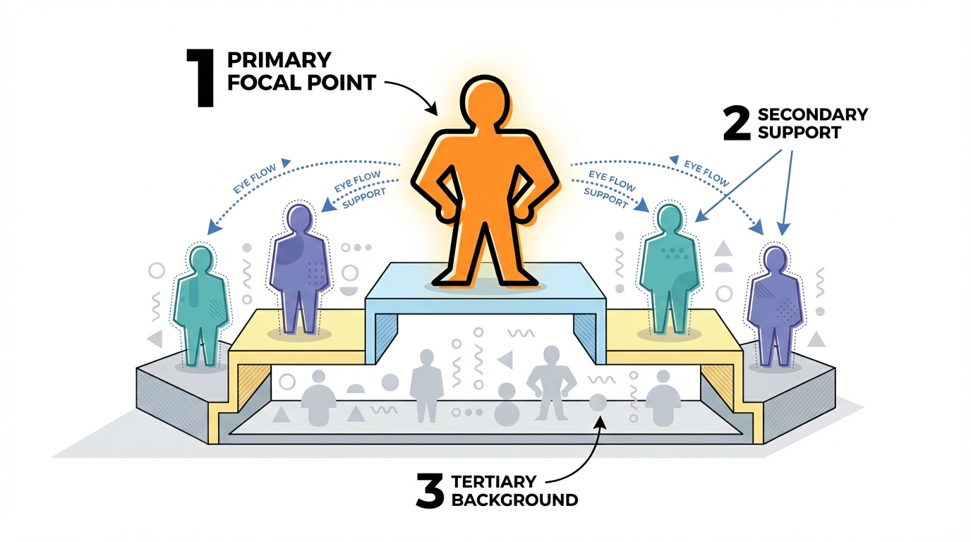
A practical way to define visual flow for figure displays is this: your primary character or moment should hit first, supporting characters and details should read clearly after that, and no favorite should be completely hidden behind something else unless you chose that on purpose.
Step 1: Decide the Story and Focal Point of Each Display
If you only do one thing, do this: give every shelf or cube a one-sentence story. Scientific figure guides recommend writing out that one-sentence main message before you draw charts or diagrams because it keeps you from cramming in unrelated data, a tactic echoed in figure design for scientific communication. The same habit is powerful for anime figures.
A story sentence might be “My Fate shelf shows the clash between Saber and Gilgamesh,” “This cube celebrates every version of Rem I own,” or “This row is all about villains watching the hero from the shadows.” Once you have that, you instantly know which figures belong, which can move to another shelf, and which props support the idea instead of distracting from it.
Display research in both art and retail shows that a strong focal piece, supported by a clean theme, anchors a space and makes the rest easier to read, which is how creative ideas for displaying art at home and retail window display ideas approach focal-point design. Translated into fandom terms: give your biggest or most emotionally important figure the literal spotlight and space it deserves, then let everything else orbit around it rather than competing.
For example, imagine a 3 ft shelf dedicated to Demon Slayer. If your main story is “Tanjiro and Nezuko vs the Upper Moons,” anchor Tanjiro and Nezuko at eye level near the center. Place Upper Moon figures flanking them, and push side characters or chibi versions toward the edges or a lower tier. The eye now reads the conflict first and the cameos second instead of seeing one long, confusing row of random demons and Hashira.
Step 2: Use Height, Depth, and Negative Space to Guide the Eye
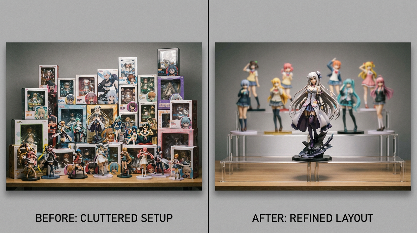
Once you know the story, you shape the flow with height, depth, and empty space. Collectible display guides highlight the power of organizing by size with the largest pieces in back, medium figures in the middle, and the smallest up front so nothing important is hidden. They also recommend centering the tallest item and stepping down toward the edges to create a pleasing arc rather than a jagged skyline. That simple size gradient naturally pulls the eye to the middle and then lets it glide outward.
Art resources on visual interest talk about contrast, variation, and deliberate negative space as the trio that keeps a composition from feeling flat, including practical tips for creating focal points and rhythm in visual interest tutorials. On shelves, negative space is not “wasted slots”; it is the breathing room that lets your favorite figure shine and keeps your brain from checking out.
This is where risers earn their hype. Imagine a standard cube that is about 12 in deep. You can place a tall 1/7 scale in the center back on the shelf itself, two mid-sized 1/8 scales on small risers slightly forward and to each side, and three chibi or trading figures along the front edge. You now have three clear tiers, and the eye naturally steps from the main character down through the supporting cast. Even inexpensive clear acrylic risers or stable household stand-ins achieve that layered stage effect.
A simple way to check your flow is to stand about 2–3 ft away, at the distance people read posters, which is also the viewing range recommended for table text on scientific posters in guidance on figures and tables. Look away, then glance back quickly and notice what you see first, second, and third. If the first thing you notice is a random prop or a bright box corner instead of the main character, that is the place to adjust heights, spacing, or the amount of empty background behind your focal figure.
A Quick Layout Comparison
You can think of common figure shelf layouts the same way designers think about composition patterns:
Layout pattern | How the eye moves | Best for |
|---|
Center peak (tallest in middle, stepping down) | Lands on center grail, then travels smoothly to sides | Symmetrical team lineups, couples, hero vs. villain face-offs |
Diagonal flow (tallest to one side, descending across) | Starts at high corner and sweeps across like a manga panel | Action-heavy scenes, characters in motion or power-up poses |
Clustered focal with empty sides | Focuses hard on a tight group, then rests in negative space | Intimate duos, single character shrines, very busy sculpts that need breathing room |
None of these are rules you must obey forever, but picking one intentionally is far better than letting figures land wherever there is room.
Step 3: Group by Theme and Rhythm, Not Just by Series
Random “everyone from this franchise” shelves usually feel chaotic because the figures do not support a single story or rhythm. Collectible display guides recommend defining themes in advance, such as grouping by character, era, or aesthetic style, so the collection feels curated and narrative-driven instead of like random piles, which is a central point in expert tips on displaying collectibles effectively. Home art resources echo this idea by treating cohesive groupings as mini-exhibitions that still leave room for variation, a strategy explained in creative ideas for displaying art at home.
For anime figures, theme decisions can be wonderfully nerdy. You might group by narrative arc (early-series vs. time-skip designs), by faction (villains facing heroes across a shelf), by color palette (all the icy blues together, all the warm reds together), or by vibe (all the smug rivals in one cube). Even when everything is technically from the same show, your eyes will have a much more satisfying path if the story within that show is clear.
Rhythm is where you mix heights, poses, and silhouettes so the shelf has a beat. Art tutorials on visual interest, such as visual interest tutorials, emphasize size and shape variation as key ways to keep compositions dynamic. On a My Hero Academia shelf, you might stagger big, explosive action poses between calmer standing poses so the movement feels intentional instead of all energy on one side and all static figures on the other. If you have multiple near-identical nendoroid bodies, changing just one pose or accessory can break an otherwise monotonous rhythm.
A helpful test is to squint slightly so you lose fine detail and only see blobs of color and shape. If your eye still understands where to start and can roughly follow a path from focal point to supporting cast, your thematic grouping and rhythm are doing their job.
Step 4: Light, Color, and Environment That Support Visual Flow
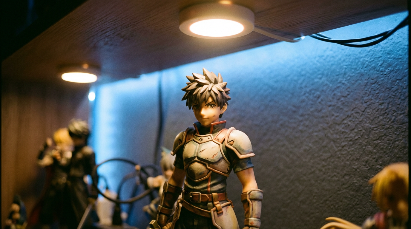
Lighting is one of the strongest tools for visual flow because the eye instinctively jumps to the brightest areas. Retail window design treats lighting and bold color as primary levers for guiding attention toward hero products, as described in retail window display ideas. For figure shelves, that means gently spotlighting your focal piece and softening or darkening everything that should sit in the background.
Low-heat LED strips or puck lights are ideal because they are bright, energy-efficient, and produce far less heat than halogens, which matters for plastic and paint over time. Professional figure and chart guidance stresses not relying on color alone to carry meaning and maintaining legibility in different viewing conditions, points highlighted in tips for tables, charts, and figures and ten simple rules for better figures. Translated to shelves, that means using light and contrast to separate planes of figures, not just blasting everything with rainbow LEDs and hoping for the best.
Try picking one accent color for the main character’s light and keeping the rest more neutral. For example, a cool white or soft blue spotlight on a water mage, with warmer, dimmer light on background allies, creates a clear visual hierarchy where your brain knows who the star is. If you prefer RGB strips, limit saturated color to the back wall or under-shelf glow, and keep direct front lighting closer to white so sculpted details and face paint remain readable.
Environment matters just as much. Display and storage guides warn that direct sunlight, heat, and humidity can quietly damage collectibles over time, even when they still look fine day to day, which is why climate-aware layouts and storage are recommended in practical organizing resources for collectors. Keep shelves out of harsh sun where possible, or use curtains and UV-filtering film if you have no choice but to display near a window. Visual communication guides also emphasize clarity and clean, simple backgrounds so figures and data remain easy to interpret, a principle echoed in using figures and charts effectively. A plain backing board, a consistent wall color, or even just removing busy posters immediately behind a display can make your figures pop without adding a single new item.
Step 5: Rotation and Overflow: Keeping the Flow Fresh
Visual flow dies when every possible surface is stuffed. Collectible display advice consistently recommends planning for growth, leaving open space, and rotating pieces rather than forcing everything out at once, both to protect items and to keep the display feeling intentional, which is a central idea in expert tips on displaying collectibles effectively. Home art resources describe “rotating galleries” that let you swap pieces in and out seasonally or when your mood changes, keeping walls lively without drilling new holes, as in rotating gallery ideas.
For figure collectors, rotation is both aesthetic and practical. You might have a main party shelf in the living room and a backup bench in storage, with figures in airtight containers or secondary cabinets waiting their turn. When a new grail arrives, you can promote it into a focal slot, temporarily retire a less-loved piece, and rework the visual flow around that change instead of squeezing it into the last 2 in of free space.
If your collection has seriously outgrown your room, off-site or closet storage with modular shelving lets you divide figures into themed sections that feel like mini-archives rather than random bins. Within that archive, clear labels and gentle lighting not only protect your pieces but also make it much easier to plan new rotations and layouts later. The key mindset is this: the display you see every day is the current chapter of your collection’s story, not the whole book.
FAQ
How many figures should go on one shelf for good visual flow?
There is no fixed number, but a useful rule of thumb is that every figure should have at least a little empty space around its silhouette and no favorite should be completely hidden from a normal standing or sitting viewpoint. If you cannot see faces clearly from about 2–3 ft away, or if weapons and bases constantly overlap into an unreadable tangle, that shelf probably needs either risers, a different layout, or a few figures moved into rotation instead of display.
Do I need expensive cabinets and lights to get good visual flow?
Nice glass cases and built-in lights help with dust and drama, but they are not essential. Many of the same principles that make professional figures and charts clear—one main message, simple backgrounds, consistent fonts or visual language, and minimal clutter—come from design guidelines like APA figure recommendations and ten simple rules for better figures. You can apply those with plain bookshelves, a couple of well-placed LED strips, some DIY risers, and the willpower to rotate instead of overcrowd.
How do I balance “museum” displays with actually handling my figures?
Think in layers. Put fragile or very rare scales deeper in the shelf or in enclosed cases where the visual flow still highlights them but they are less likely to get bumped. Place nendoroids, prize figures, and durable PVC closer to the front or on lower tiers where hands naturally go. That way, your eye still reads the shelf as a single, composed scene, but your most handled pieces live where they are easy and safe to grab.
A well-flowing figure display feels a bit like your favorite anime opening: it hits you with a strong first image, carries you through a sequence of moments, and leaves you with a final shot that sticks in your mind. If you let story, height, grouping, light, and rotation do the heavy lifting, your shelves stop being storage and start being a living, evolving tribute to the worlds and characters you love.