Techniques to Create Depth in Displaying Collectible Figurines
Depth in a figurine display comes from layering composition, light, and color so each shelf reads like a small three-dimensional scene instead of a flat row of characters.
Ever look at a glass case loaded with grail pieces and feel... underwhelmed, like everyone is stuck in a crowded yearbook photo instead of an anime opening? After enough late-night reshuffles that turned stiff lineups into little stages, one thing keeps proving itself: the displays that feel alive rely more on deliberate depth tricks than on simply adding more figures. By borrowing a few cross-media techniques and adapting them to shelves, you can give your favorite characters room to breathe, interact, and tell a story every time you flip on the lights.
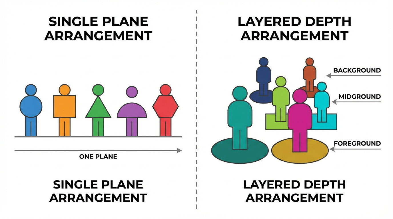
Think in Foreground, Middle Ground, and Background
Photographers often break a scene into foreground, middle ground, and background to make a flat image feel three-dimensional, and that same three-layer structure works beautifully when you arrange figures on a shelf, as shown in guides that emphasize foreground structure in landscapes. Instead of lining everyone up shoulder to shoulder, imagine the glass as a 2D frame and ask what lives closest to the viewer, what sits at the center of attention, and what pushes back toward the wall as context.
Art instruction on depth in drawing points out that viewers usually read elements lower in the frame as nearer and those higher up as farther away, and that overlapping shapes signal which objects are in front. Classic tutorials on the illusion of depth stress that bigger, sharper, lower objects feel closer, while smaller, softer, higher objects recede. The same cues translate directly when you place a tall scale figure slightly behind and above a chibi whose head overlaps the base of that larger piece.
On an actual shelf, that theory turns into a simple habit. Use short characters, trading figures, and props along the front as your foreground. Park your main protagonist or centerpiece in the middle with a bit of space around their silhouette. Let taller scales, mechs, or backdrops anchor the rear. When the eye can step from front detail, through a clear subject, into a softer background, even one shelf starts to feel like a still frame from a scene rather than storage.
A practical example helps. Imagine a shonen lineup where every character stands in a single row facing forward. The moment you move a sidekick slightly forward so their hair and weapon overlap the hero's base, put a villain up on a riser in the back, and tuck a tiny prop like a street sign or rubble pile right against the glass, you suddenly get the feeling of an alleyway standoff instead of a crowded police lineup. Nothing changed about the figures themselves, but the depth cues did.
Composition Tricks Borrowed from Art and Film
Film schools teach that depth on a flat screen comes from four main tools: selective focus, light and shadow, linear perspective, and occlusion, the way nearer objects partially cover those behind them, as outlined in cinematography tips on creating spatial illusion. On a shelf, you rarely control focus with a lens, but you control the other three every time you decide who overlaps whom and where the lines of the display lead.
Traditional drawing tutorials emphasize that overlapping is one of the strongest depth cues, alongside consistent perspective and diminishing scale. Placing one object partly in front of another instantly tells the viewer which is nearer. That means it is often worth letting one base or cloak obscure a bit of another base, even if it hides a logo, because the tradeoff in spatial clarity makes the whole vignette read better from normal viewing distance.
Linear perspective appears on shelves whenever you angle figures or props so that something like a road, railing, or row of bases seems to recede toward a point instead of staying parallel to the glass. Painting demos on creating the illusion of depth show how lines that converge toward a horizon pull the eye inward and support the feeling of distance, especially when combined with softer edges farther back. In practice, even something as simple as angling effect parts or weapon tips toward an imaginary vanishing point behind your centerpiece can create a subtle path for the eye to follow into the scene.
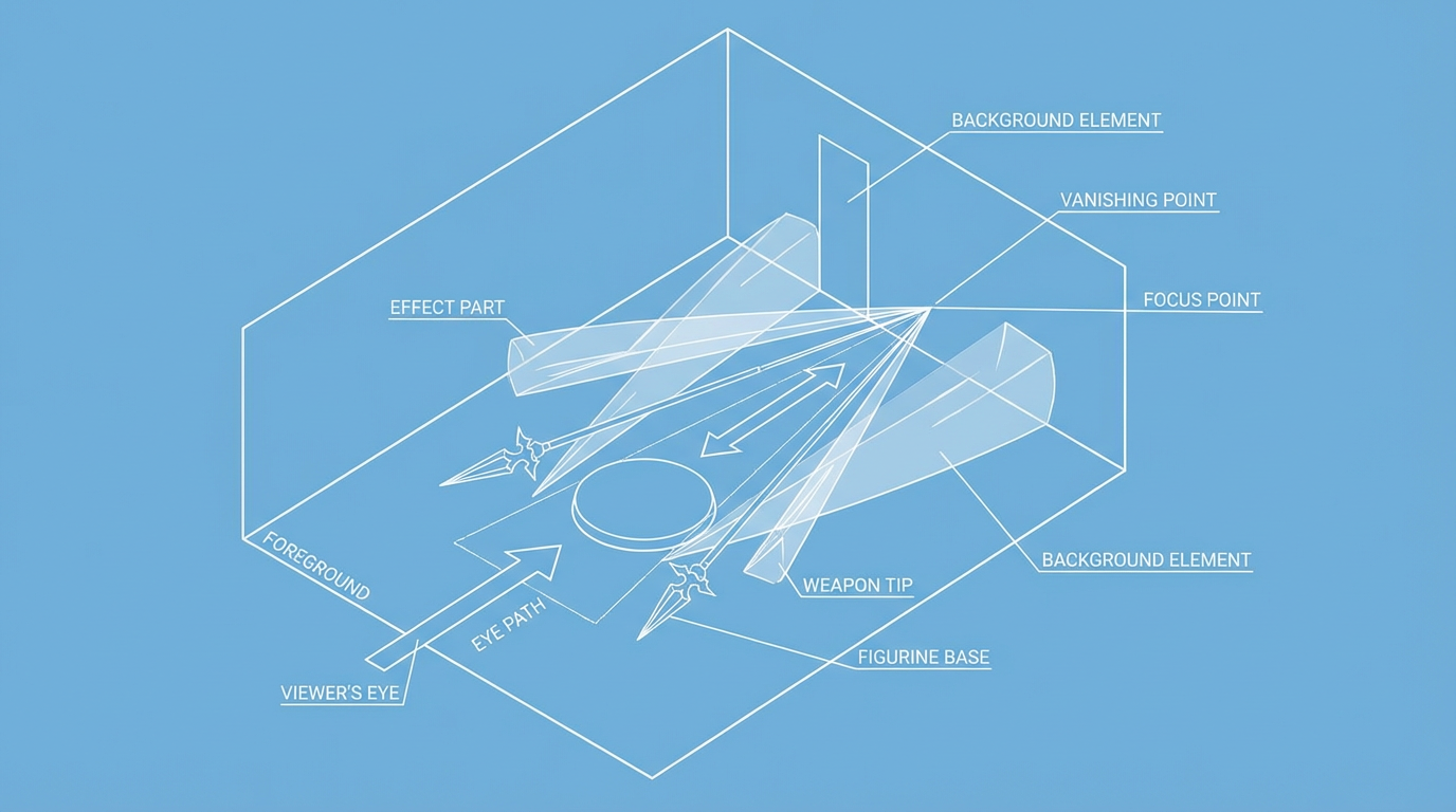
Foreground elements that touch the glass subtly hook viewers into the display, a role that foreground rocks, flowers, or textures play in landscape photography where strong near details help build depth around the main subject. A low crate under a Nendoroid, a bit of terrain from a model kit, or even a manga volume laid flat under a pair of trading figures can serve the same purpose: something small, close, and detailed that invites you to lean in before your gaze climbs to the main figure and then drifts back to scenery or antagonists behind them.
Light and Shadow: Making Sculpted Details Pop
Cinematography advice is blunt that light and shadow do a huge share of the work when it comes to depth. Higher-contrast lighting with clearer shadows generally makes shapes feel more dimensional than very soft, flat illumination, a point emphasized in discussions of light-driven depth. Many figure displays fall into the too-flat trap because they rely on a single bright overhead LED panel that wipes out shadows on faces and folds, leaving the sculpt looking closer to a product photo than a physical object.
Design tutorials on depth in user interfaces lean heavily on the idea that realistic depth comes from many small gradients and gentle shadows rather than one harsh, heavy drop shadow, and they recommend treating each surface as if a real light source were hitting it from somewhere above. That same mindset works when you place LED strips or spotlights in a cabinet. A slightly angled light from the side or above that throws a mild shadow under chins, along hair, and behind outstretched arms can do more for depth than doubling the brightness, especially when you let the back of the shelf fall a notch darker than the foreground to keep figures from blending into the wall.
Art demos on atmospheric depth point out that sharper edges and stronger value contrasts belong in the foreground, while middle and background objects benefit from softer edges and lower contrast so the viewer can easily tell which plane is which. When you light a display, this means you often want your brightest, crispest light on the main subject and a slightly softer, more diffused light on whatever you identify as background, whether that is a city print, stone wall diorama, or simply taller figures you want to read as farther away.
A small, very practical tweak is to avoid only front-facing light.
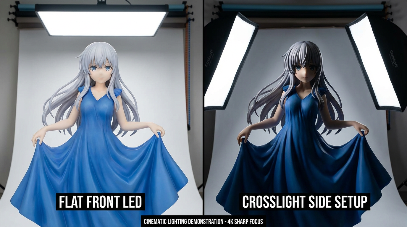
When all the illumination comes directly from the viewer's side, a figure's form collapses visually, especially around hair and clothing folds. A front-and-side combo or a gentle crosslight lets sculpted lines cast tiny shadows on themselves, which helps the brain parse distance in the same way it does when looking at a live actor on a set lit with layered sources instead of a single on-camera flash.
Color, Atmosphere, and Backgrounds
Painters who specialize in depth often rely on a warm foreground and a cooler, duller background to make flat canvases feel like they stretch into space. Warmer colors pop forward while cooler, bluer ones quietly recede, especially when combined with softer detail in the distance. That warm-front, cool-back strategy pairs nicely with shelf displays where character palettes and backdrops might otherwise clash, and it echoes the way atmospheric perspective turns distant mountains lighter and bluer while nearby grass stays rich and warm.
Studio discussions on layering versus blending in painting explain that layering involves stacking distinct passes of color or medium that remain at least partly separate, building complexity and depth over time, whereas blending smudges those boundaries into a smoother gradient, a distinction explored in practical writing on layering and blending. When you think about your shelves, you want layering more than blending: separate color zones and planes that interact without turning into one big color soup.
Resin artists who pour multiple clear or translucent layers over paintings, embedding different media at each stage, show how stacking physical layers lets light bounce between surfaces and creates a literal depth you can look into, a process showcased in discussions of resin layering. Translating that idea to figurines, you can use semi-transparent acrylic backboards, smoky risers, or thin sheets of acrylic in front of certain figures to catch reflections, softly frame them, and make the space feel deeper without blocking sightlines.
Background prints and dioramas become much more effective when they respect these same rules. A city backdrop with heavy, high-contrast linework and very saturated colors will fight the figures for attention and flatten the scene. If you instead choose or modify art so that distant buildings are slightly lighter, cooler, and less detailed than the characters, you let them stay in the story while clearly reading as background, echoing the way atmospheric perspective simplifies faraway forms in painting.
A Cross-Media Playbook for Figurine Depth
The most reliable shelf makeovers tend to reuse the same handful of tricks from photography, film, and painting, just applied to PVC instead of paper or screens. The table below summarizes some of the strongest cues and how they translate.
Depth trick | Core idea | Shelf application |
|---|
Foreground interest | A small, close object hooks the eye, then leads it to the subject, a technique emphasized in landscape discussions of foreground depth. | Place a short figure, prop, or book near the glass so it overlaps the bases behind it and invites viewers to look in before they notice the main character. |
Overlap and scale | Bigger, overlapping forms read as closer; smaller, partially hidden ones read as farther, a point stressed in classic depth drawing tips. | Let one character's cape or weapon obscure part of another base, and avoid lining heads up at the same height so size differences and overlaps tell a clear distance story. |
Light and shadow | Stronger contrast and defined shadows sculpt form and space in flat images, as cinematography tutorials on lighting for depth explain. | Use angled LEDs and a slightly darker background so the main figure's highlights and cast shadows stand out, rather than washing everything with perfectly even white light. |
Layering materials | Stacked translucent layers let light bounce and create literal and visual depth, a principle used in layered resin paintings. | Combine clear risers, acrylic backboards, and physical props so light passes through and around objects, making the cabinet feel like a box of overlapping planes rather than flat shelves. |
A One-Shelf Makeover in Practice
Take a single shelf of mixed shonen characters that currently stand in a straight row against a bare white backing. The first change is to decide who owns the middle ground; maybe that is the main protagonist in an action pose. Move that figure slightly off center to avoid dead symmetry, then push them a couple of inches back from the front so there is room for smaller characters or props near the glass to become foreground.
Next, give the background something to do besides reflecting your face. Even a simple printed gradient that fades from a richer, warmer tone near the bottom to a slightly cooler, lighter tone near the top sets up a sense of air and distance behind the figures, echoing the way artists use gradations and cooler hues in distant areas to hint at depth. Tape or mount that print so it sits cleanly behind the bases rather than curling; this instantly separates character silhouettes from whatever is behind them.
Then, bring in height layering and overlap. A couple of clear risers or stacked art books under the back row can lift a rival or mentor character so their head sits higher and slightly behind the hero, with at least one element like a cape or weapon partially overlapping the figure in front. Smaller mascots, chibi versions, or effect parts can live right at the front edge, overlapping both the bases and the shelf lip, creating the equivalent of rocks or flowers in a landscape foreground.
Finally, rework the lighting. Add a warm white strip or puck light above and slightly ahead of the main figure so it throws a mild shadow backward, then let the back of the shelf stay a stop darker so the gradient background and tall characters do not overpower the foreground. If you have a second, cooler light, put it toward the back or side to give a hint of cool rim along hair or weapons, reinforcing the warm-front, cool-back tension that makes painted scenes feel deep.
Once everything is in place, step back to normal viewing distance and squint slightly.
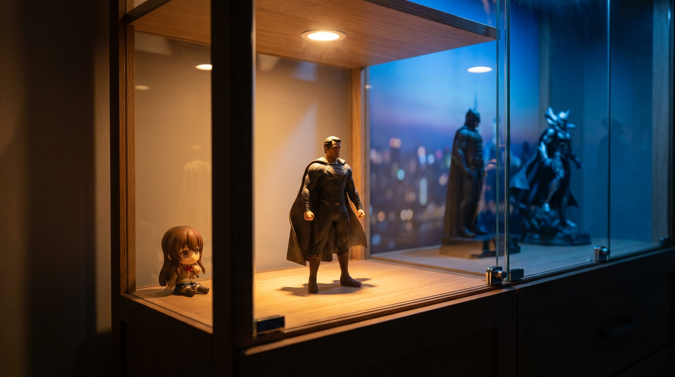
You should see a clear hierarchy: something small and near at the front, a clear subject in the middle, and taller, softer layers behind. Most importantly, your eye should want to explore the scene rather than bounce off a flat wall of faces.
When you treat your figures less like items in a store and more like actors on a tiny stage, every shelf becomes a chance to direct a scene instead of just fill space. The more you borrow from how painters, photographers, and filmmakers build depth, the more your favorite characters will feel like they are living their best anime lives right there behind the glass.