Understanding Symmetrical Aesthetics in Figure Placement Techniques
This guide shows how to use symmetrical and controlled asymmetrical layouts to turn figure shelves into balanced, gallery-style displays that are easy to enjoy, light, and maintain over time.
Symmetrical figure placement turns a busy shelf into a calm, gallery-style showcase by balancing characters, colors, and light around clear focal points while still protecting your collection.
You know that moment when you’ve spent an hour shuffling figures, step back, and the shelf still feels like chaos instead of an anime shrine? Many collectors find that once they apply a few simple symmetry rules, the exact same figures suddenly look cleaner, more intentional, and easier to appreciate. Here you’ll get practical, repeatable techniques to build symmetrical layouts that feel powerful rather than stiff, with real-world tips on poses, lighting, and long-term care.
Why Symmetry Matters in Figure Displays
Display designers describe symmetry as mirrored or equal arrangements that instantly read as ordered and unified when you walk into a room. Interior stylists use this principle when they flank a focal piece with matching decor to create balance and calm in a space where you actually want to sit and enjoy your collection. Symmetrical layouts built around a central object are a classic way to make the most important piece feel like the “main character,” while still letting supporting pieces shine. High-end interiors often lean on paired elements that echo each other across a center line. Shelf stylists note that more traditional rooms especially benefit from symmetrical arrangements because they feel stable and timeless rather than chaotic. That same shelf styling advice translates almost perfectly to a cabinet full of PVC heroes.
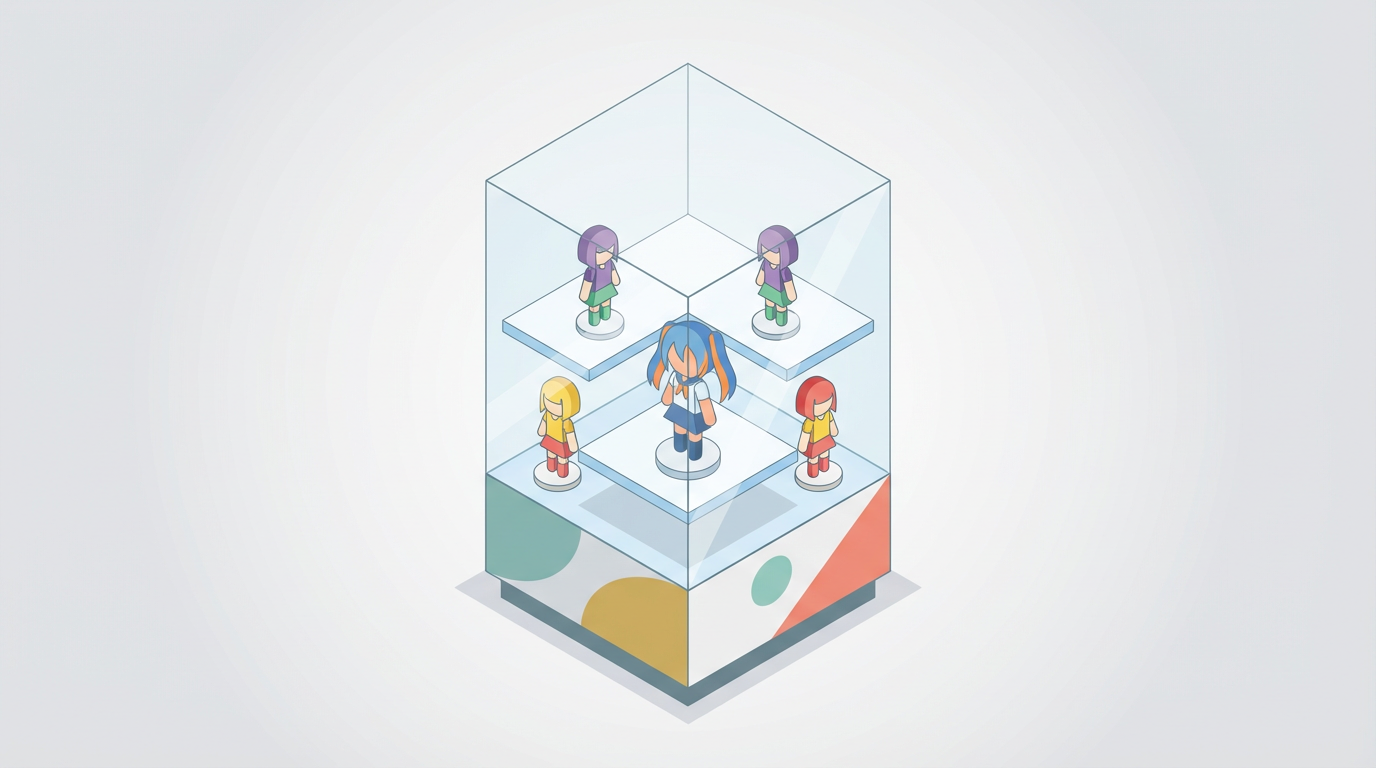
For figure collectors, that same logic does something powerful: symmetry tells your brain where to look first. When your eye lands on a clear focal point and then finds mirrored shapes, colors, and heights on either side, the whole lineup reads as a single composition instead of a jumble of separate purchases. Collecting experts suggest concentrating pieces in defined zones instead of sprinkling them around the room so the collection feels like one story rather than visual noise, a strategy that works whether you’re displaying porcelain, vinyl toys, or rare scale figures in your living room. Grouping collections into focused areas makes every shelf feel intentional rather than like overflow storage.
Symmetry vs Asymmetry: Which Serves Your Scene?
Design writers often contrast symmetry, where both sides of a display mirror each other in size, color, or shape, with asymmetry, where pieces are unevenly placed but still feel balanced because they share a palette or style. Definitions that frame symmetry as equal arrangements are especially useful when you’re deciding how to pose your favorite characters together. Many interior designers also love asymmetry built from odd-number groupings and loose triangle shapes because it keeps the eye moving, and they often recommend that kind of triangle composition when placing varied objects on shelves. Arranging objects in triangles with varied heights and textures is one of the most common tricks in home decor, and it can mesh beautifully with a symmetric backbone.
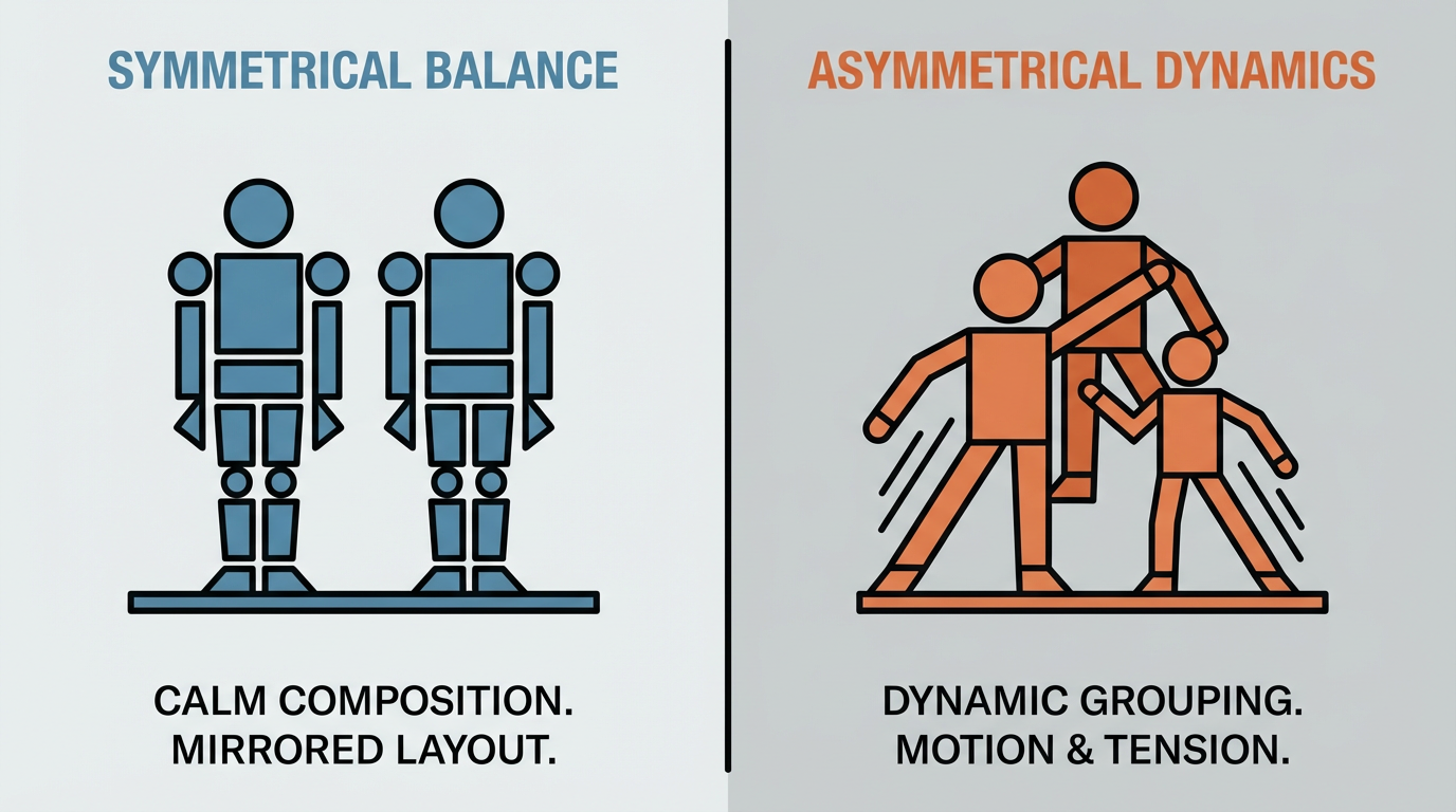
In practice, symmetry shines when you want a calm “altar” vibe: think a grail figure centered with equal visual weight on both sides, or a pair of matching characters mirroring each other around a logo or series title. Asymmetry is perfect for chaotic battle dioramas or big, cinematic scenes where motion and drama matter more than formality. The sweet spot for most collectors is a symmetric skeleton with controlled asymmetry inside it: the overall widths, colors, and heights balance from left to right, while individual poses and props keep the scene from feeling like a toy store window.
Approach | Best for | Pros | Watch-outs |
|---|
Symmetrical layout | “Shrine” shelves, grails, duos, pairs | Calm, gallery-like, easy to read and to dust | Can feel stiff if every shelf is perfectly rigid |
Asymmetrical layout | Action scenes, large varied armies | Dynamic, story-heavy, looks like a snapshot moment | Can slide into clutter if color/height aren’t managed |
Core Principles of Symmetrical Figure Placement
Curators and interior stylists recommend starting any display by choosing a focal point and building around it instead of spreading favorite pieces thin across every surface. That mindset is just as helpful for anime figures. Creating a clear focal area for a collection gives you an anchor: pick a center line on the shelf, then choose the “star” that belongs dead center on that axis. For a single-shelf setup, that might be your tallest 1/7 scale figure on a riser; for a multi-shelf cabinet, it could be the entire middle shelf, with the most important character at its center. From there, every placement decision becomes, “What balances this on the opposite side?”
Shelf stylists emphasize spotlighting just a handful of “stars” and giving them breathing room, which amplifies their presence and keeps everything from looking like a thrift-store jumble even if you own a hundred pieces. Advice to edit heavily and leave space around key objects lines up perfectly with how you’d treat limited editions or expensive resin statues: centralize the most meaningful figure, then build mirrored pairs outward using characters of similar scale and visual weight. If your centerpiece is a tall, fiery Rengoku, you might place two mid-height Demon Slayer allies at equal distances on each side, then two shorter supporting characters or props at the far edges. As you move outward, keep an eye on height and bulk so one side doesn’t feel visually heavier than the other, even if you technically have the same number of figures.
Even in very symmetrical setups, many designers like to use subtle triangles and mixed heights because they keep the display from feeling flat while maintaining balance. Recommendations to vary height and texture in loose triangular groupings can be layered into symmetry by using risers so your central figure is slightly taller than the pair next to it, which in turn are taller than the figures on the far ends. Figurine specialists suggest stepped platforms and staggered levels to add depth without distracting from the pieces themselves, so combining risers with a symmetric layout is a powerful combo. Using tiered risers and staggered heights ensures every figure is visible while still keeping the left and right sides in harmony.
Keeping Symmetry From Feeling Boring
Figurine display experts often stress that cohesion matters more than raw figure count, which means you can keep a symmetric structure without locking every pose into a copy-paste stance. Guidance that prioritizes cohesive themes and color schemes over sheer volume frees you to treat symmetry as a backbone, not a prison. You can mirror broad traits—like physical size, color intensity, or how “serious” a character feels—while letting micro-details differ. For instance, two flanking figures can both be mid-height heroes in similar color palettes, but one leans slightly forward in an attack pose while the other looks back over a shoulder. From normal viewing distance, the display still reads symmetrical, yet the scene has life and movement.
Posing technique helps here. Posing guides recommend finding balance from the feet up, keeping the figure’s center of mass over its base and adjusting ankles, hips, and torso while the feet stay planted, which is crucial when you want mirrored stances that actually stay upright. Once the central character feels rock solid, you can echo that stability by giving flanking characters complementary poses that still keep their weight centered over their stands. If you need help with tricky stances, museum putty or specialized stands can stabilize dramatic poses without ruining the clean symmetric silhouette.
Symmetry in Different Types of Figure Setups
Glass Cabinets and Acrylic Cases
Action figure storage guides highlight glass-fronted cabinets and clear acrylic cases as a go-to choice when you want both protection and display, keeping dust, pets, and accidental bumps away while still letting you admire the sculpted details. Recommendations for tempered-glass or acrylic cases with adjustable shelves are especially useful for symmetric layouts: adjustable shelves let you line up eye-level focal points, while glass doors frame your arrangement like a museum vitrine. Symmetry inside a cabinet starts with the full rectangle of shelves, not just individual ledges, so imagine a vertical line cutting right through the center of the doors and build mirror-image groupings outward from that line across multiple levels.
Stackable acrylic boxes, popular with collectors who want modular displays, work the same way. A grid of clear cases becomes your canvas: for instance, a two-by-three stack where the middle column hosts your main protagonist on top and their final-form variant below, with mirrored supporting characters in the left and right columns. Collectors who use these boxes often note that four-high stacks feel like a practical ceiling for stability, so building symmetrical towers in pairs—two identical columns on either side of a monitor or bed—creates a strong, safe frame for your favorite characters.
Wall Shelves and Narrow Desks
Floating shelves and slim wall racks are ideal when floor space is limited but wall space is generous, and interior designers often use them to turn a blank wall into a gallery of personal objects tied to the room’s decor. Tips that suggest echoing collection colors in nearby furniture and textiles are incredibly helpful if you want symmetry that feels integrated rather than tacked on. With two or three wall shelves, treat them as one tall rectangle: line up the central figure vertically on the middle shelf, then echo smaller, related groupings directly above and below.
For a shonen-themed desk, you might center a single big Ichigo figure on the middle shelf, back it with a neutral print, and then place two smaller Soul Society captains at equal distances on each side. Above, a narrower shelf could hold two symmetrical props—say, sword replicas or minimalist logo plaques—stacked directly over the captains. Below, a lower shelf might repeat the pattern with chibi versions or small blind-box pulls. The result is a vertical spine of symmetry that frames your monitor or workspace like a manga panel.
Lighting and Preservation: The Hidden Half of Symmetry
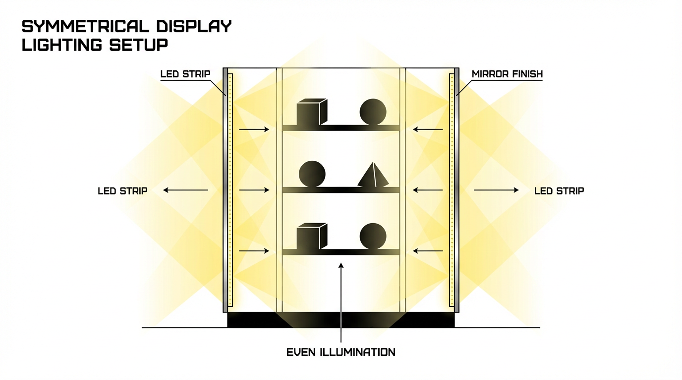
Action-figure storage guides strongly favor LED strip and spot lighting placed along the edges or under shelves, since LEDs produce much less heat than old-school bulbs and can be aimed to avoid glare on glossy plastic. Using LED strips and under-shelf lighting to create even illumination is perfect for symmetrical setups, because you can mirror the light sources just like you mirror the figures. Mount strips down both side edges of a cabinet or under paired shelves, then balance brightness so one side of the display is not washed out while the other disappears into shadow. Figurine display experts also talk about layering overhead, spot, and backlighting so the whole scene has depth and drama rather than a single, flat beam of light. Layering multiple light types with adjustable intensity lets you dial in whether your symmetric shrine feels cozy, eerie, or like a museum case.
Preservation-wise, anime figure care guides warn that direct sunlight and UV gradually fade paint and degrade plastics, and recommend keeping figures in shaded or enclosed areas away from windows whenever possible. Advice to avoid direct sunlight and UV exposure to protect paint and materials pairs well with symmetric layouts, because your “hero” axis will usually sit in the safest, most controlled part of the room rather than in a sunny corner. Professional storage resources also suggest cool, stable temperatures around 65–70 °F with moderate humidity near 45–55 percent to prevent warping, mold, or brittleness, especially for plastics that can off-gas and deteriorate under stress. Guidance to maintain cool temperatures and mid-range humidity is just as relevant to PVC and ABS as it is to older artifacts, and the more evenly you space your figures, the easier it is for air to circulate and for you to monitor their condition.
Many guides also recommend rotating which pieces are on display and adjusting orientations periodically so one side of a figure is not always taking the hit from ambient light. Suggestions to periodically rotate displayed collectibles and adjust their positions mesh nicely with symmetry: when you swap out one flanking figure, swap its counterpart on the other side as well so the overall structure stays balanced, and when you turn a figure slightly to show a different angle, mirror that small adjustment on its partner.
Practice: Designing One Symmetrical Shelf From Scratch
Imagine you have a 36 in wide glass shelf and six figures from the same series. Start by clearing everything off so your eye is not fighting background clutter. Mark the center of the shelf with a piece of masking tape, then place your main character directly over that mark, ideally on a small riser so the head sits just below eye level. Once that central axis feels locked in, set two mid-sized figures on each side at equal distances from the center, checking from a few steps back that they appear to occupy the same “visual weight” even if their poses differ. If one has an enormous cape or effect part, you might nudge it slightly closer to the center and scoot its partner out a bit to compensate.
Next, add your final pair of smaller figures or props on the outer edges, again keeping distance and height in mind. This is where you can play: maybe the outer pair leans inward slightly, forming a gentle curve that frames the group, or perhaps they are both kneeling while the inner pair is standing, creating a stepped silhouette. After the figures feel right, layer in lighting by adding an LED strip along the back edge or under the shelf above, and dim it until it highlights the center figure without blowing out the colors. Finally, take a quick photo on your cell phone; seeing the shelf flattened on a screen often makes small imbalances obvious. Adjust spacing a half inch at a time until the shot looks as satisfying as a key visual from the show.
FAQ
Do both sides have to match perfectly for my display to count as symmetrical?
Not at all. Display experts define symmetry in terms of equal visual weight more than pixel-perfect mirroring, so as long as each side feels equally strong in size, color, and presence, your brain will read the layout as balanced. Discussions of symmetry in interior displays that focus on balance and unity leave plenty of room for small differences, and high-end interiors often use similar, not identical, pieces in pairs. The same idea works beautifully with figures: you might have a cape on one side and a large weapon on the other, or a serious pose balancing a more relaxed stance, as long as the overall outline and color intensity match.
Is it okay to mix scales in a symmetrical figure display?
It can work very well if you plan carefully. Home decor guidance encourages mixing sizes and shapes on shelves as long as there is a clear rhythm and repeated elements to create cohesion, rather than a random pile of objects. Suggestions to blend large and small objects while keeping a unifying palette are a good model: pair a tall 1/7 scale figure on one side with a slightly shorter 1/8 scale plus a small prop, then echo that combo on the opposite side. As long as each side of your center line feels equally “full” and the color story is consistent, mixed scales can make the symmetry more interesting instead of less.
When you finally dim the room and your cabinet glows like a tiny gallery of your favorite worlds, that subtle left-right balance is what makes the whole collection feel intentional rather than accidental. Symmetry is just the framework; your stories, characters, and poses are what turn that structure into a display you’ll be proud to show off every time someone asks about your figures.