Applying The Golden Ratio In Character Design For Figures
If you have ever unboxed a new anime figure, set it on the shelf, and thought, “This one just feels right,” there is a decent chance you were feeling the pull of a very old idea: the golden ratio.
From Renaissance paintings to modern UI layouts, this proportion shows up wherever creators obsess over harmony. Character designers and figure sculptors are no exception. Some of them even keep physical golden‑ratio calipers on their desks while they sketch or sculpt. As a long‑time figure collector and pose-tweaker who has spent more hours than I want to admit staring at joints and neck angles, I can tell you: when you use phi well, a character suddenly looks less like plastic and more like a moment from the anime that got frozen in time.
In this article, we will dig into what the golden ratio actually is, what research really says about it, and, most importantly, how to use it in character design for anime figures in a way that is practical, flexible, and grounded in real evidence rather than hype.
What The Golden Ratio Actually Is (Without The Headache)
Artists and designers have been talking about the golden ratio for centuries. Mathematically, it is a proportion usually written as phi and is approximately 1.618 to 1. Several design sources, including articles from Artsper Magazine, CreativePro, and the Interaction Design Foundation, describe the same core idea: when you divide a line so that the whole length is to the longer part as the longer part is to the shorter part, you get this special proportion.
If you prefer equations, many references summarize it with the relationship x² = x + 1. Solving that gives around 1.618. In more everyday language, you can think of it as a sixty‑two percent to thirty‑eight percent split instead of a fifty‑fifty split. This shows up in the “golden rectangle,” where the long side is about 1.618 times the short side. Remove a square from this rectangle and you are left with another golden rectangle, and you can keep repeating that subdivision. If you draw quarter‑circle arcs through each square in that nesting, you get the famous golden spiral.
The Fibonacci sequence is the other half of the story. Articles from Artsper, Canva, and CreativeBloq all mention that if you start with zero and one, and keep adding the last two numbers together to get the next one, you get a sequence like zero, one, one, two, three, five, eight, thirteen, twenty‑one, thirty‑four, fifty‑five, eighty‑nine, and so on. When you take the ratio of two neighboring Fibonacci numbers, for example eighty‑nine over fifty‑five, the result gets very close to 1.618. That is why many diagrams build the golden spiral out of Fibonacci‑sized squares.
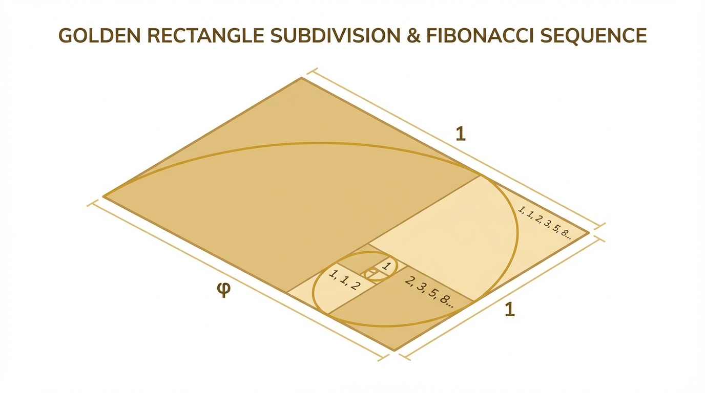
For creators, the important point is not the algebra. It is that you have a repeatable, asymmetrical proportion that shows up in a lot of natural forms and historical artworks, and you can use that same proportion to decide where to put weight, breaks, and focal points in a character.
Here is a quick comparison that lines up some common composition tools you might know with the golden ratio.
Proportion system | Basic split | How it feels in design |
|---|
Golden ratio (phi) | About 62% / 38% | Slightly off‑center, “natural,” and dynamic; heavily used in classical art and modern design guides |
Rule of thirds | About 66% / 33% | Easy shortcut approximation; simple grid that many cameras use as an overlay |
Half‑and‑half | 50% / 50% | Very stable but often static or boring, especially for dynamic characters |
A painting instructor at Virtual Art Academy suggests using simple three‑to‑five or five‑to‑eight divisions of space as a practical stand‑in for the golden ratio. For figure design, that kind of “close enough” thinking is usually more useful than chasing perfectly precise decimals.
What Science Actually Says About Phi And Beauty
The golden ratio has collected a lot of myths. You will often hear claims that almost every famous painting or building is secretly built on phi, or that the human brain is wired to prefer exactly that ratio over all others. A philosophy discussion summarized by several authors, including the physicist Mario Livio, points out the problems with these stories. Measurements are often cherry‑picked, rectangles are drawn loosely over paintings, and some natural spirals get stretched to fit a golden spiral template.
So should we throw phi out entirely? Not quite.
A recent study in PLOS ONE looked directly at this question. Researchers tested whether people prefer images that follow the golden ratio versus very similar proportions. They showed two hundred fifty‑six adults a wide range of images: human bodies, classical sculptures, paintings, geometric shapes, and virtual humanoid avatars. Each image came in three versions: one at the golden ratio (around 1.618), one at 1.5, and one at 1.8. People repeatedly chose which version they felt was more aesthetically pleasing.
The result was subtle but real. Across fifty‑one comparisons, participants picked the golden ratio version about fifty‑three percent of the time. That is not a dramatic “everyone loves phi” verdict, but it is statistically significant. The preference was stronger for human bodies, anthropomorphic sculptures like Venus de Milo or Doryphoros, and paintings than it was for abstract geometric figures or plain avatars.
In a second experiment, the same team used eye‑tracking with a smaller group and found that images people judged as more beautiful tended to attract shorter total viewing time, suggesting that the visual system processed those images more efficiently. Images in golden‑ratio proportions tended, on average, to be processed slightly more fluently.
Taken together, and combined with summaries from the Interaction Design Foundation, a reasonable evidence-based conclusion emerges. The golden ratio is not a magic key that unlocks perfection. It is one of several proportions that the visual system handles comfortably, and it seems especially effective when we are looking at human‑related forms: bodies, faces, and classical‑style compositions. That is exactly the territory character designers and figure sculptors live in.
The safest way to treat phi is as a gentle bias in your favor, not as a universal law.

It can tip a design from “pretty good” toward “strangely satisfying,” especially for figurative characters, but it does not replace taste, anatomy, or storytelling.
From Page To PVC: Applying Phi To Character Proportions
So how does this old proportion climb down from Greek temples and design blogs into the world of anime figures and collectible statues?
One of the clearest bridges comes from character designer Stephen Silver, whose work includes shows for major studios such as Disney Television Animation and Nickelodeon. In a GoldenNumber.net article about his approach, he calls the golden ratio his “secret weapon” for designing appealing characters, props, and environments. The way he talks about it lines up perfectly with what we experience staring at shelves of PVC.
Small, Medium, Large: Breaking The “Ladder” Habit
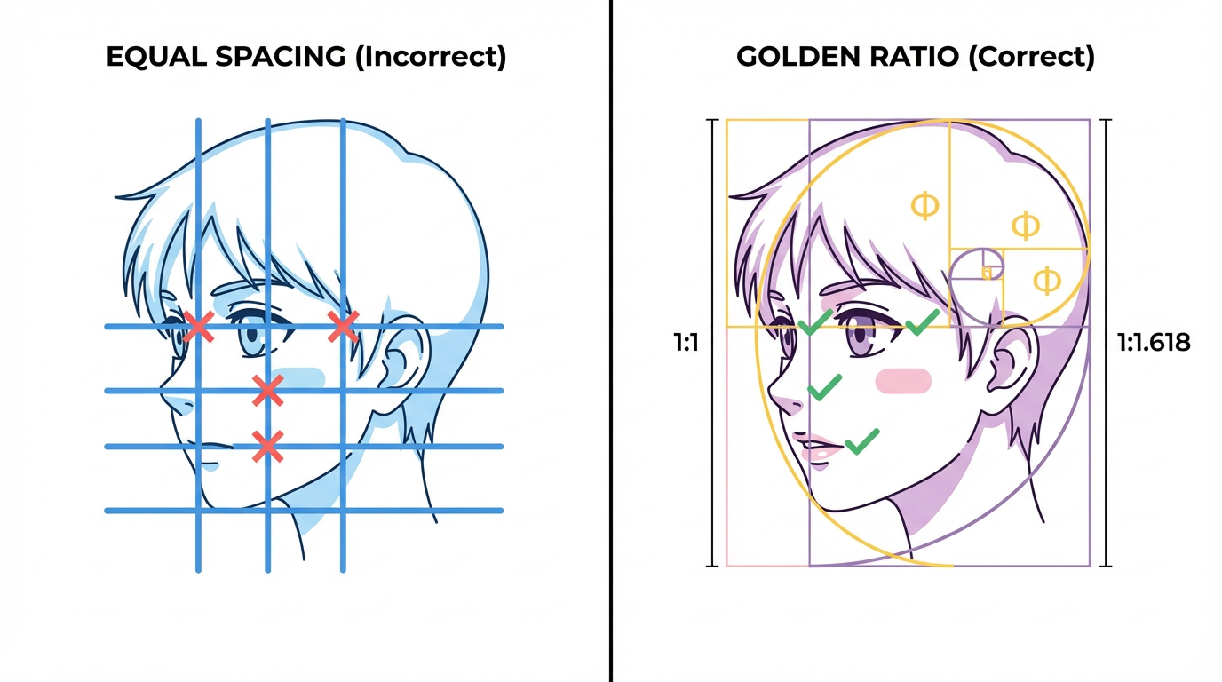
Silver describes a common beginner mistake he calls the “ladder.” You stack body parts or clothing details so that the spacing between them is equal, like rungs on a ladder. In figures, you can spot this when a character’s belt, jacket hem, and knee joints seem evenly spaced, or when layers of armor are all the same size. The result is tidy but mechanical, and it fights against the organic rhythm our eyes expect from living bodies.
Phi gives you a clean way out of that. Because 1:1.618 naturally creates a “small, medium, large” relationship, you can use it to size and space repeated elements. The GoldenNumber article points to examples in nature and anatomy: segments of fingers, sections of insects, or the way tree branches step down in size. Translating that into anime characters is surprisingly straightforward. Maybe the distance from waist to knees is your “large,” knees to ankles is “medium,” and shoe sole thickness is “small.” Or your armor plates grow smaller by roughly the same ratio as they move away from the chest.
You do not need a calculator for this. That same Virtual Art Academy advice to think in three‑to‑five or five‑to‑eight ratios is enough. As long as each step feels noticeably, but not wildly, larger or smaller than the last, you are moving in a golden‑ratio direction and breaking the ladder look.
Faces That Feel Alive On The Shelf
The PLOS ONE study found that golden‑ratio preferences are strongest for human bodies and sculptures. GoldenNumber.net digs into why by mapping phi onto specific facial and body measurements.
According to that article, you can find near‑golden ratios in several facial relationships: the distances from hairline to eyebrows to chin, the width of the mouth compared to the width of the face, and the width of the nose in relation to the lips. It also notes proportions in the forearm relative to the hand and in finger segments. Wallpics and Naturalist Gallery add similar observations about forearm-to-hand relationships and the way navel height relates to total body height.
Anime pushes those proportions in stylized directions, but the underlying relationships can still echo phi. Imagine a bishoujo figure where the distance from the tip of the chin to the base of the nose is your “short” segment and the distance from the base of the nose to the hairline is the “long” segment. If that upper region is about one‑point‑six times the lower region, you are in golden‑ratio territory. The same thinking applies horizontally: the mouth might sit in a sweet spot where its width is a golden fraction of overall face width.
In practice, I have found this most useful when a face feels “off” for reasons that are hard to verbalize. If the eyes are perfect but the character still has a mannequin vibe, checking the relative distances—chin to lip, lip to nose, nose to brow, brow to hairline—often reveals a hidden ladder pattern. Nudging those breaks toward a three‑to‑five relationship, instead of four‑to‑four, can suddenly make the face feel more alive, even when the viewer could not tell you why.
Bodies, Limbs, And Stylized Proportions
A LinkedIn article on 3D cartoon character proportions describes the central challenge as balancing realism and stylization. Heads get larger, limbs get thinner or thicker, and anatomy bends toward personality, but there still has to be an internal logic. That same piece explicitly mentions the golden ratio as a useful guideline for relationships between head, torso, and limbs.
You can think of a standing figure’s height as a stack of big shapes. There is the head-and-neck block, the ribcage and pelvis block, and the legs block. Instead of splitting height into equal thirds, try imagining a three‑to‑five or five‑to‑eight vertical division borrowed from painting advice. For example, the distance from the soles to the pelvis might take roughly five units, and from pelvis to top of the head another three units. You are not aiming for exact math; you are aiming for an uneven but harmonious split that avoids halving the character right at the waist.
The same thinking works horizontally. Shoulder width, ribcage width, and hip width rarely look best when stacked as equal bars. Using a golden‑ish progression, shoulders as “large,” ribcage as “medium,” hips as “small,” or vice versa, gives the silhouette that small‑medium‑large rhythm Silver talks about, echoed in the GoldenNumber article’s anatomical breakdowns.
This does not mean every character should be built on the exact same template. The LinkedIn discussion points out that childlike characters often have heads that are a huge chunk of their total height, while heroic or elegant characters stretch the limbs. Phi simply gives you a gentle guide to keep those exaggerations feeling intentional rather than random. You can still design a chibi whose head is almost half the body; you might just make each body segment downstream shrink in a golden‑ish way so the design still feels grounded.
Chibi, Bishounen, And Mecha: Adapting Phi Across Figure Types
Different figure genres invite different proportional games.
For chibi and super‑deformed designs, the main golden‑ratio work tends to live inside the head and face. You can keep body proportions almost toy‑like while still using phi to place facial features, shape the hair mass, and size accessories such as bows or hats so that they come in a pleasing small‑medium‑large rhythm.
For bishounen and bishoujo figures, you can combine facial and body phi. Mouth width, eye spacing, and nose placement can all riff on the facial relationships described above, while the torso-to-leg split uses that three‑to‑five mindset. Many examples of classical sculptures referenced in naturalist and gallery articles show similar patterns, and those same nudges often work almost uncannily well when applied to anime silhouettes.
Mecha and armored characters bring in another layer: repeating mechanical elements. The same GoldenNumber article that analyzes anatomy also talks about using phi in props and graphic design. If a robot’s armor plates, pistons, and vents are all equal size, the result looks like a grid. Varying those parts in golden‑ish steps—big shoulder plates, medium forearm armor, small wrist units—gives the machine a more organic presence while still reading as artificial.
Composing Pose, Base, And Effects With Phi
Proportions are only half of what makes a figure sing. The pose, base, and effect parts control how your eye moves through the piece on the shelf. A lot of modern composition advice from photography and design can be translated directly into figure work.
Golden Rectangles On The Base
Virtual Art Academy outlines a three‑step golden‑ratio method for canvases: divide an edge into eight parts, draw a line at the third mark, draw another line at the corresponding third on the adjacent edge, and use their intersection as a focal area. That three‑to‑five split is just another expression of phi.
Imagine applying that to a circular or rectangular figure base. Instead of planting your character dead center, you can treat the top view of the base as a golden rectangle. Place the character’s feet near one of the intersections of the golden divisions rather than right in the middle. Similar strategies show up in web layout guidance from the Interaction Design Foundation, where they divide a nine hundred sixty‑pixel layout into content and sidebar sections about five hundred ninety‑three and three hundred sixty‑seven pixels wide. The idea there is the same: one block is roughly 1.618 times the other.
For figures, this can mean giving one side of the base more visual weight, for example piling rubble or water effects on one side while leaving more open space on the other, and positioning the character at the point where the big and small zones meet. The result tends to feel more like a snapshot from a scene and less like a chess piece.
Guiding The Eye With A Golden Spiral
Several design and photography articles, including those summarized by Skylum and Wallpics, emphasize the golden spiral as a way to lead the viewer’s gaze. Starting with a big rectangle and spiraling inward through Fibonacci‑sized steps creates a curve that feels more natural than an evenly spaced spiral.
If you look at many dynamic anime figures, you can almost trace a spiral through flowing hair, billowing capes, and energy effects. You do not have to overlay a perfect golden spiral template, but you can use the idea: start with the widest arc of motion and coil it so that it tightens near the character’s face or primary gesture hand.
Interaction Design Foundation’s examples of mobile layouts using a golden spiral show how tightly this can control focus even on a small screen. The same applies in three dimensions. If a ribbon or weapon swing roughly follows a spiral that guides your eye from the base, up the limbs, and into the character’s expression, the figure quietly feels more intentional. If those elements instead splay out evenly in multiple directions, your eye may ping‑pong around without landing anywhere satisfying.
From personal experience rearranging figures in a display case, you can even use a crude version of this without remodeling anything. Try rotating a figure so that the main arc of their pose lines up with an imaginary spiral that leads toward your favorite part of the sculpt. Often, a quarter‑turn is enough to transform a pose from stiff to fluid, precisely because you are aligning it closer to a natural viewing path.
Pros And Cons Of Designing Figures With The Golden Ratio
It is tempting to either canonize the golden ratio as the ultimate secret or dismiss it as numerology. The reality, based on research and practice, sits comfortably in the middle.
On the plus side, phi gives you a simple way to avoid some very common design traps. Silver’s “ladder” problem, equal halves everywhere, and monotonous repetition can all be softened by aiming for uneven but related proportions. The PLOS ONE study suggests that, across many different stimuli, golden‑ratio versions have a small but reliable advantage in preference, especially for human bodies and sculptures. And UX research summarized by the Interaction Design Foundation connects phi to the “aesthetic usability” effect: people tend to perceive well‑structured visuals as more usable and trustworthy, even before they consciously analyze them.
On the minus side, critical reviews collected in philosophy discussions show that a lot of historical golden‑ratio claims are retrofitted. Rectangles get drawn loosely over the Mona Lisa or the Parthenon and declared proof, even when there is no documentation that the artists cared about phi at all. Experimental replications of early rectangle‑preference tests have been mixed, and some meta‑analyses have concluded that a strong universal preference for golden rectangles is unlikely.
For figure design, the risk is not academic. If you chase phi so obsessively that you start stretching limbs or crowding details simply to hit a 1.618 ratio, you may break anatomy, personality, or engineering constraints. Livio’s argument that great artists endure by deviating from rigid canons, rather than bowing to them, is worth keeping in mind: the figures that stay legendary are usually the ones that capture a character’s soul, not just their math.
The healthiest stance is to treat the golden ratio as a seasoned senpai: listen, learn, then break the rules when the story demands it.
A Practical Workflow For Figure Artists
If you want to bring the golden ratio into your character design process without turning your desk into a math lab, it helps to give each stage of work a clear job.
In the concept stage, focus on story and personality first. As the LinkedIn discussion of 3D character proportions emphasizes, stylization choices like giant eyes or exaggerated muscles should serve who the character is. Once you have a strong idea, you can start checking for ladder patterns and dead‑center placements. At this point, it is enough to think in terms of “do I have a small, a medium, and a large?” for major shapes such as head, torso, and legs.
During rough sketches or low‑poly blocking, bring in explicit phi tools if you want them. GoldenNumber’s article mentions a physical golden mean gauge sold for about ten dollars, which lets artists compare distances quickly. Digital sculptors and illustrators can use software overlays like the PhiMatrix design tool or phi‑based grids available in many layout programs. Figma’s resource library describes workflows where you set up a frame with a 1:1.618 ratio and drop in guides at key phi positions; the same idea works on a drawing canvas in Clip Studio or Photoshop.
As your design tightens, treat phi as a quality control test rather than a commandment. Do features like the eyes, mouth, and hairline form a pleasant rhythm, or are they evenly stacked? Does the torso feel like exactly half the figure, or can you nudge the waistline up or down to get closer to a three‑to‑five split? Are accessories and effects all the same size, or do they step down naturally?
Finally, in the pose and base stage, think like the painters at Virtual Art Academy and the UX designers at the Interaction Design Foundation. Decide where you want the viewer’s eye to land—usually the face or gesture hand—then check whether your base layout and motion arcs support that. If rotating or shifting the character toward a golden‑ratio division of the base makes everything suddenly click, you have just used phi the way it works best: as a quiet, behind‑the‑scenes compositor.

Here is a compact reference that ties key figure design levers to golden‑ratio tactics.
Design area | How to use phi | What to watch out for |
|---|
Facial features | Let distances from chin to lip, lip to nose, and nose to brow vary in a small‑medium‑large rhythm; echo studies linking golden ratios to facial appeal | Do not force features into phi if it breaks the character’s recognizable look |
Body blocks | Divide height into uneven sections (for example legs vs torso‑and‑head) with three‑to‑five or five‑to‑eight style splits | Avoid cutting the figure exactly in half at the waist unless you want a very static feel |
Limbs and armor | Size repeating elements so each is meaningfully bigger or smaller than the next rather than identical | Too many equal plates or joints can create a lifeless “ladder” pattern |
Pose and effects | Shape capes, hair, and weapons to roughly follow a spiral that tightens around the main focal point | Overly symmetrical or evenly spaced effects can scatter attention |
Base composition | Place the figure near a golden‑ratio intersection on the base and balance masses accordingly | Perfect centering can work for stoic characters but often feels less dynamic |
Quick FAQ For Figure Fans And Creators
Do I need to understand the math to use the golden ratio in character design?
Not really. Most artists and sculptors use it through eyeballed rules of thumb. The painting advice to think in three‑to‑five or five‑to‑eight divisions, and Silver’s emphasis on small‑medium‑large groupings, are both practical translations of phi. The research and historical material from sources such as Virtual Art Academy, CreativePro, and the Interaction Design Foundation simply explain why those tricks tend to feel good.
Does every great figure use the golden ratio?
No. Critical reviews of golden‑ratio myths make it clear that many claims about old masterpieces are exaggerated. Some modern artists and designers, like Salvador Dalí and Le Corbusier, have consciously built works around phi, and character designers such as Stephen Silver swear by it. Others rely more on intuition, anatomy, and narrative. The PLOS ONE study suggests phi gives you a modest advantage, not a guarantee.
Is the golden ratio still useful if my style is super stylized or chibi?
Yes, as long as you treat it as a guide rather than a cage. The LinkedIn discussion of 3D cartoon characters emphasizes that exaggerated heads and eyes still need internal consistency. You can apply phi to relative distances within the face, to the spacing of accessories, or to the balance between base and body, even when overall proportions are wildly stylized.
What if I try phi and my design looks worse?
That is your answer. Livio’s critique of rigid aesthetic canons reminds us that the best artists are the ones who feel free to break rules. If pushing a waistline or eye level toward a golden‑ratio division makes the character less like themselves, trust the character. Phi is there to serve your design, not the other way around.
From the first pencil scribble to the last PVC prototype, the golden ratio is one more powerful tool in your kit. It connects centuries of art theory, recent perception research, and the quiet craft of sculpting faces and folds. Use it to dodge the obvious, to sneak in that extra bit of natural rhythm, and to help your favorite characters step off the shelf with just a little more soul.
References
- https://pmc.ncbi.nlm.nih.gov/articles/PMC9787369/
- https://openlab.citytech.cuny.edu/langecomd3504sp2021/files/2021/05/Final_Presentation_SalomeMindiashvili-compressed.pdf
- https://www.interaction-design.org/literature/topics/golden-ratio?srsltid=AfmBOoo92YjRcU_jdjnupsk_yU-EZIRu_qLHD5o1UoxVNESYv4NEhanb
- https://www.goldennumber.net/golden-ratio-cartoon-character-design/
- https://www.creativebloq.com/design/designers-guide-golden-ratio-12121546
- https://creativepro.com/the-golden-ratio-the-art-of-creating-balanced-compositions-in-design/
- https://www.linkedin.com/pulse/how-ensure-proper-proportions-3d-cartoon-characters-whizzystudios-g7zlf
- https://skylum.com/blog/everything-you-need-to-know-about-the-golden-ratio
- https://www.virtualartacademy.com/golden-ratio-in-art/
- https://www.1st-art-gallery.com/article/the-influence-of-golden-ratio-in-iconic-paintings/?srsltid=AfmBOopU_FGlQhCpuObJK8rDAFjyEwYG_-df-EYiM34ngvnwhCQrnFOZ