Essential Guidelines for Color Coordination in Figurine Displays
Color-coordinated figurine displays turn scattered shelves into mini anime galleries by using deliberate palettes, backgrounds, and lighting so every character reads clearly from across the room.
Ever look at your shelves and feel like your favorite characters are lost in a noisy rainbow of bases, boxes, and LED glare? Collectors and interior designers who plan color first and objects second consistently get calmer rooms and more “wow” moments from the exact same collection. By the end, you’ll know how to choose colors, backdrops, and lights so your figures look as epic on display as they do in your imagination.
Start With Mood, Not Paint
Before thinking about specific hues, decide how you want each display to feel. Color psychologists suggest starting with the emotion you want in a space—calm focus, cozy nostalgia, high-energy hype—and then choosing art and objects that support that mood rather than fighting it, which is how serious art collectors build color-conscious collections that genuinely change how a room feels around them psychology of color in art. For a desk where you work or study, that might mean a cooler, more restrained palette around your figures; for a gaming corner or TV shrine, you might lean into louder, warmer colors that match the adrenaline.
Color theory gives you the toolkit to do this on purpose instead of by instinct. In classic color theory, the color wheel maps how hues relate so you can predict which combinations will clash and which will harmonize, a framework artists lean on every time they design impactful sneakers or digital art color theory in your artwork. Warm colors like red, orange, and yellow tend to feel passionate and energetic; cool colors like blue, green, and purple usually read as calm or mysterious. If your shelf is full of fiery shonen heroes and lava effects, surrounding them with mostly cool blues and teals can actually make the flames feel hotter, while an entire “ice magic” shelf in pale blues and purples will naturally feel quieter and more contemplative.
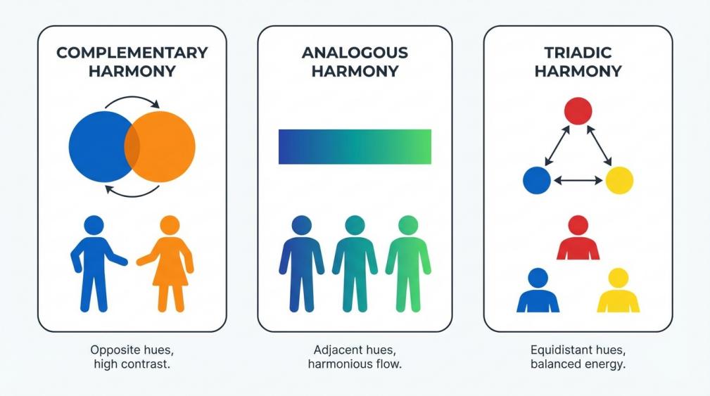
Within that, three simple harmony types cover almost everything you’ll need. Complementary schemes use colors opposite each other on the wheel—think deep blue armor with bright orange effect parts—for maximum contrast and drama. Analogous schemes use neighbors on the wheel, such as blue, teal, and green, to create smooth gradients and a serene, nature-like feel. Triadic schemes balance three evenly spaced colors, like red, blue, and yellow, for a playful, highly “anime opening credits” kind of energy. Pick one harmony per shelf, then let your figures, bases, and props fall into that structure instead of trying to feature every color all at once.
Build a Cohesive Palette Across Room and Shelves
A display never lives in a vacuum; your figures sit inside a larger room with wall paint, furniture, and ambient light already pushing a palette. Color-focused collectors often create a simple “color map” of their space first—wall color, wood tones, major textiles—and then choose art that plays with those relationships instead of competing with them. Interior designers do something similar when they declutter, hide everyday mess in closed storage, and let curated collections echo colors already in pillows, rugs, or curtains so the room feels intentional and not like a merch dump make collections look beautiful.
The cabinet or shelf itself should join that story. Stylists who work with glass cabinets often recommend keeping the cabinet’s overall palette aligned with the room—similar whites, creams, or neutral woods—so visual chaos doesn’t start before anyone even sees your characters styling a glass display cabinet. If your room already leans cool, a black or dark gray frame around bright figures gives them a cinematic, gallery vibe. In a warmer, wood-heavy space, stained shelves with mostly earth-toned props can make fantasy or historical characters feel rooted instead of out of place.
Cohesion also comes from how you group the figures themselves. Display pros repeatedly stress grouping by clear themes—type, era, color, or narrative—rather than scattering similar pieces everywhere, because tight, story-based clusters read as a collection where random scattering reads as clutter. You can echo that with color: a “blue magic” shelf, a “red battle” shelf, a “pastel slice-of-life” shelf. Designers who specialize in turning clutter into décor often limit each display to just a few dominant tones and repeat them in different materials, which keeps shelves calm even when there are a lot of objects on them.
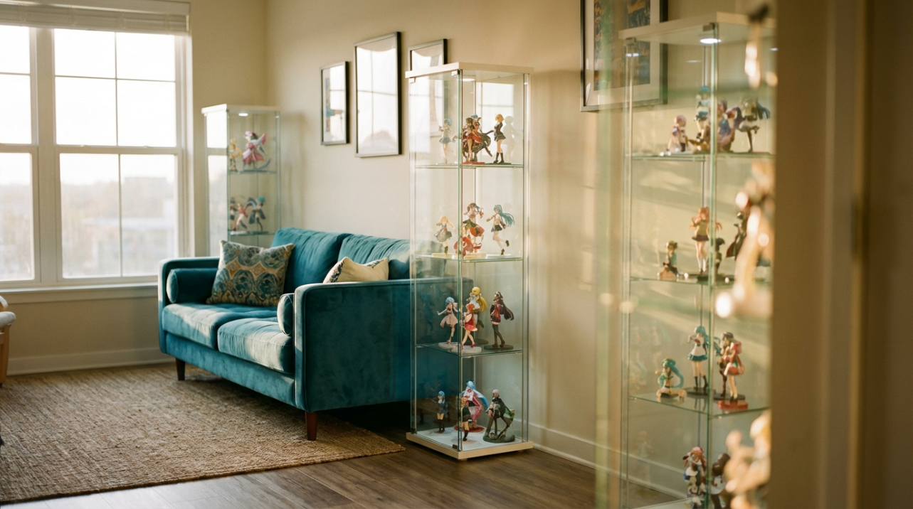
If you have three glass cases side by side, try treating each as a separate emotional zone. One might be icy cool with white and blue figures and light wood risers, another full of saturated reds and oranges with darker bases, and a third centered on neutral tans and greens. When those three cases share at least one color with the surrounding room—maybe your sofa throw or rug—your display feels like part of the space instead of a plastic invasion.
Backgrounds, Bases, and Backdrops
Background color is the secret weapon in figurine coordination. Framing experts talk about choosing backing colors that complement the items inside a frame, not compete with them, so the eye goes to the collectible first and the background second. Dark backers like charcoal, navy, or black make bright hair, pale skin, and metallic armor explode forward; light backers like pale gray or cream soften the mood and are kinder to already dark figures. For really busy sculpts with lots of tiny color hits, a solid neutral behind them can be the difference between “overwhelming blob” and “heroic centerpiece.”
If you want subtle color without visual noise, think in terms of soft, colored mats rather than loud patterned paper. Collectors who display coins and small artifacts have found that light blue or turquoise felt is surprisingly effective as a backdrop because it supports shine while keeping colors readable and gentle on the eye. That same idea works beautifully for anime figures: a soft aqua panel behind warm-toned characters or fiery spell effects keeps the drama while preventing skin tones from going too orange, and it can echo sky or water motifs common in anime key art.
Base and riser colors matter just as much. Display-case designers note that black bases create crisp contrast for lighter objects, mirrored bases amplify details from every angle, and clear bases basically vanish so the figure alone carries the color weight. Repeating the same base color across a whole cabinet is an easy hack for instant cohesion: even if characters come from different series, the matching bases make them feel like one team.
The final ingredient is breathing room. Professional arrangers treat “negative space” as part of the design, leaving intentional gaps so each object can be read clearly and the background color actually shows. Collectors styling glass cabinets also warn against stuffing every inch of a shelf; a little empty space keeps things feeling curated, not chaotic. As a practical rule, if bases are almost touching or you can’t see the shelf surface between them, you’re probably choking your color scheme. Slide figures apart until you can see at least a strip of background color around each base and you’ll notice the whole palette relax.
Use Light to Make Colors Look Right
You can nail the palette and still ruin it with the wrong LEDs. Collectors of diecast models who experiment with lighting have found that warm white LEDs skew toward a yellow cast and can feel cozy but not very bright, while cool white LEDs look extremely bright yet slightly bluish and harsh, changing how painted details read LED color choices. A third option, often labeled “daylight” or “natural,” sits in between, keeping colors more believable and providing enough brightness without washing everything out.
Here is a quick way to think about display lighting:
LED color type | Visual vibe | Best for figurines | Main downside |
|---|
Warm white | Cozy, slightly yellow | Nostalgic scenes, wood-heavy rooms, muted palettes | Can push whites and skin tones too warm |
Daylight / natural | Neutral, like indirect sun | Accurate colors on skin, hair, and outfits; mixed collections | Slightly less “dramatic” than very warm or cool |
Cool white | Bright, crisp, slightly blue | Mecha, techy or sci-fi shelves, clear parts that need sparkle | Can make warm palettes feel cold or cheap |
Natural or daylight LEDs are usually the safest starting point if you care about paint accuracy and subtle gradients, especially on skin and pastel hair, because they avoid the heavy yellow or blue shift that warm and cool lights create. Cabinet makers increasingly build in LED strips or spots for exactly this reason, since targeted lighting can turn an ordinary shelf into something closer to a museum case. If your system allows adjustable color temperature, you can tune the light cooler for guns and armor, then warmer for cozy slice-of-life displays without changing the hardware.
Just as important as color temperature is what you keep out of your display. Direct sunlight is a long-term enemy of paint; cabinet designers explicitly advise keeping cases away from harsh sun and using enclosed fronts or tinted glass to limit fading and dust. Framing specialists go further and recommend UV-protective glass or acrylic for especially valuable pieces so color stays stable for years instead of slowly bleaching out. Standard acrylic already blocks a significant portion of UV; dedicated UV-filtering panels are engineered to block most of what’s left, which is worth considering for rare or signed figures.
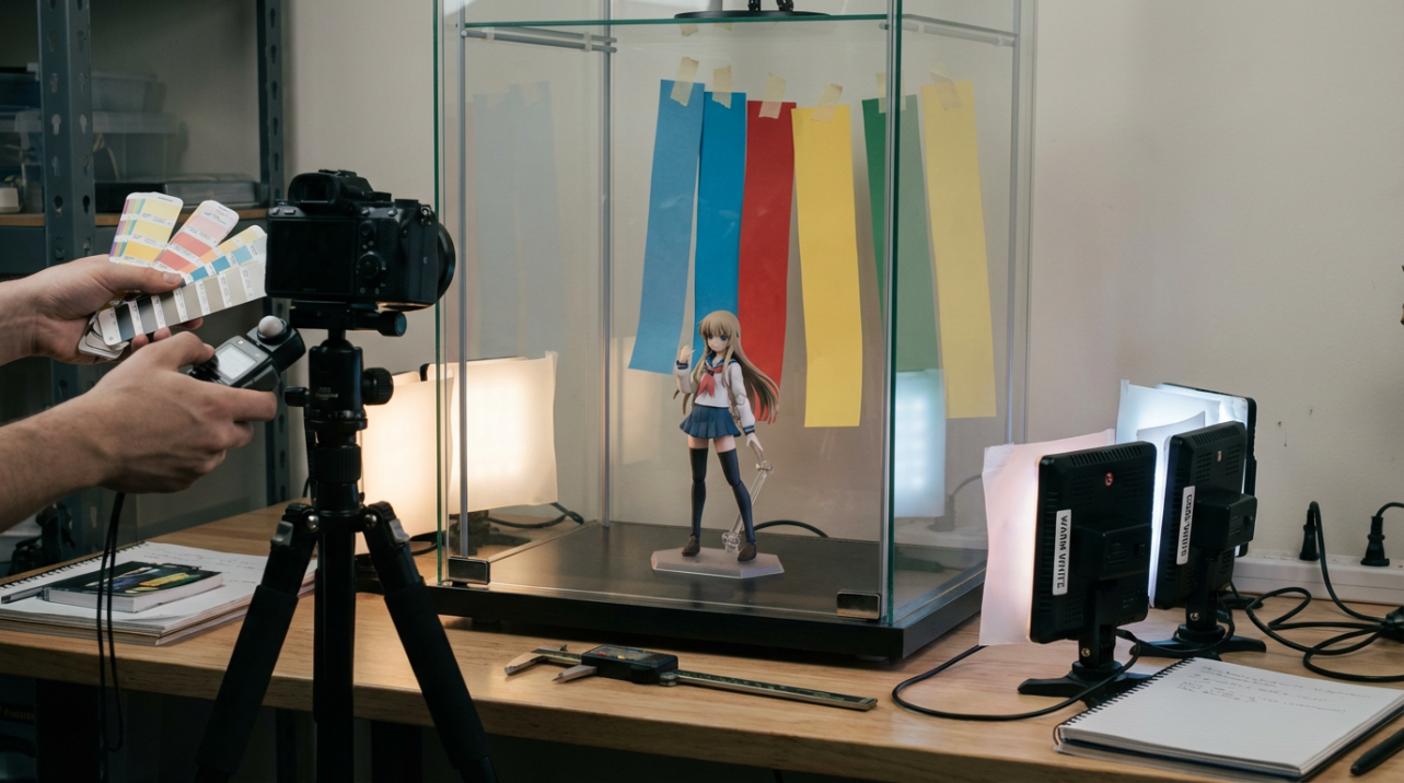
A simple experiment can help you tune everything: take one mid-tone figure, put it in your case, then temporarily tape white, black, and colored paper behind it, and cycle through your available light modes. Watch how the hair, skin, and shadows change with each combination. The one that makes the sculpt look closest to the promo photos is the combo to build the rest of your display around.
Tell a Color Story, Not Just a Roll Call
The most memorable displays don’t just show off how many figures you own; they tell a story. Display-case designers treat cases as storytelling tools, often putting one “hero” piece in the center and arranging supporting items around it in a way that guides the eye and explains why this group exists together. Color is one of the easiest ways to hint at that story. You can line up a progression of outfits from muted rookie colors on the left to intense final-battle palettes on the right, or group characters by elemental colors—blues for water users, reds and oranges for fire, greens and golds for nature and support.
When you mount or orient pieces, think about how they “talk” to each other. Collectors hanging directional items like weather vanes often angle them so they face toward one another instead of randomly, which instantly makes the group feel more intentional and connected inward-facing groupings. You can mimic that by angling opposing rivals slightly inward on either side of a shelf, using their contrasting color schemes to frame a neutral-toned protagonist in the middle. Their colors and poses will read like a mini poster every time you walk past.
Rotating displays is another powerful trick. Color psychologists recommend changing palettes with the seasons—warmer, cozier tones in winter and cooler, fresher palettes in summer—to keep spaces psychologically supportive as life shifts. Cabinet makers echo this idea, encouraging collectors to swap what’s front-and-center for holidays, new shows, or just to reawaken their own attention. In practice, that might mean a rich, red-heavy battle lineup in fall and winter, then a pastel or ocean-colored lineup for spring and summer, all using the same shelves and lights.
Quick FAQ
How many colors are too many in one figurine display?
A good rule of thumb is to choose two or three main colors and let everything else be supporting neutrals. Interior designers who specialize in collections find that limiting the palette this way keeps shelves feeling calm even when they are full of objects, because the eye can group similar hues instead of fighting visual static. If you love lots of different colors, spread them across multiple shelves instead of cramming every shade into a single case.
What if my figures all have clashing colors from different series?
When palettes clash, unify everything with shared neutrals. Matching bases, a consistent background color, and one shared accent—like gold details or clear blue spell effects—can pull a wildly mixed cast together the way identical frames and mat colors pull mismatched art into a coherent gallery.
Should I repaint bases or props to match my color scheme?
If a base color really wrecks your palette, repainting can be worth it as long as you accept that it may hurt resale value. Customizers who work with color theory advise testing combinations on a small area or on scrap plastic first and thinking about the emotional impact you want—high contrast for drama, closer hues for calm—before committing to a full repaint.
Color coordination is where your inner fan and your inner curator meet. When you tune mood, palette, backgrounds, and lighting with the same care you give to picking new pre-orders, your shelves stop being random storage and start feeling like tiny, glowing anime museums you get to walk past every day.